Revisiting The Google Pixel C - Better, But Not There Yet
by Brandon Chester on February 17, 2016 8:01 AM ESTDisplay Comparison
Due to the nature of smartphone and tablet sampling, it's not often that we get two units of a device sent to the same reviewer. Since I already had to set this Pixel C to 200 nits for battery life testing, I figured that it would be interesting to see how the accuracy compares to the original review unit that we received. While a sample size of two is still hardly enough to make any definitive conclusions on the variance from unit to unit, it is an interesting exercise in seeing how far or how little two completely different units differ from one another. If you're looking for more commentary on the Pixel C's display I encourage you to check out the display analysis page in original review.
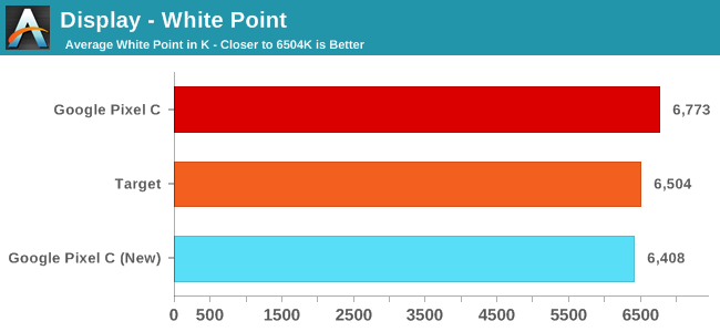
Something that I quickly noticed about this new Pixel C unit is that the display is warmer than the original one. This is hardly a surprise, with all mobile devices having fairly high variability with the white point. While the last one was above the standard illuminant D65, this one is a bit below. What this does imply is that Google is probably hovering around D65 with their white point target, so there doesn't appear to be a heavy shift toward the blue to improve battery life, which is something you do see on many other smartphones and tablets. The low power LTPS panel is seemingly able to keep power low enough that shifting toward blue to improve backlight efficiency isn't required to achieve good battery life.
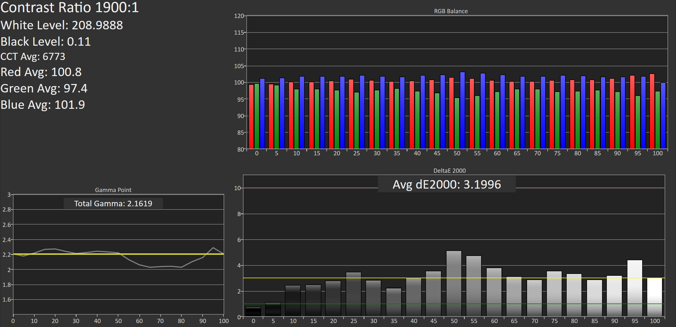
Original Pixel C
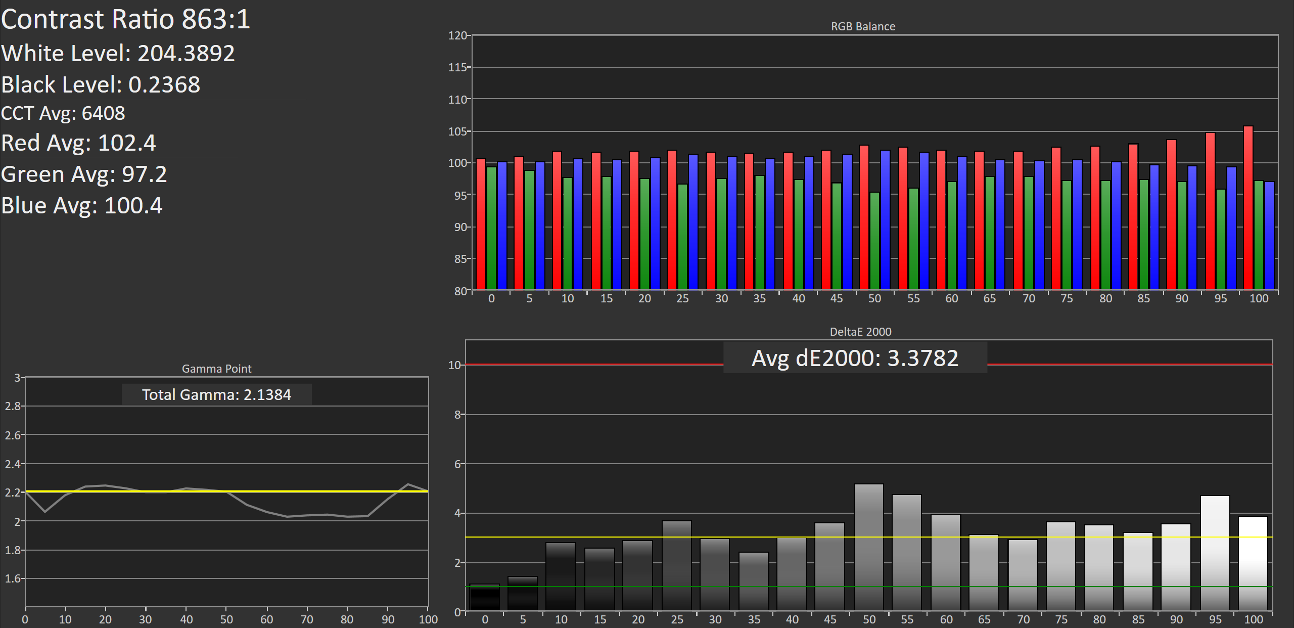
New Pixel C
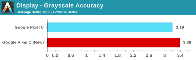
This new Pixel C performs a bit worse in our greyscale accuracy test, but the difference really isn't noticeable. In fact, the similarity between the results on both devices is almost spooky, although it really just speaks to the level of consistency Google is enforcing. Due to the green component of luminance dropping off as you move toward 100% white you see similar errors for each shade of grey. I actually tested again to make sure I hadn't accidentally tested the same unit twice, even though the differing white points made me fairly sure of that. While Google isn't giving you ridiculous levels of calibration with DeltaE values below 1, it is clear that they're fairly consistent with targeting a DeltaE of around 3 for greyscale.
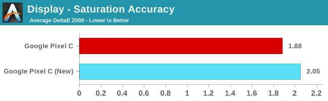
Saturation accuracy drops a bit on the new Pixel C, but it's really not a big enough difference to make an impact on even highly color sensitive workflows.
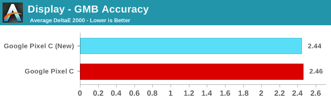
In the color checker test we see that both Pixel C units have equivalent average error values. There's not much else to be said here, as both panels are at a point where further improvements to color mixture accuracy won't really bring any tangible benefit.
As I said before, two units is hardly enough to make a conclusion about Google's calibration standards. That being said, you can definitely use the data to get an idea of how tight their tolerances are. I think in this case it's clear that you'll be getting a pretty accurate display with the Pixel C, and the biggest difference will be whether your white point leans more toward red or blue.


67 Comments
View All Comments
lmcd - Wednesday, February 17, 2016 - link
I mean to be fair, RemixOS looks like Windows 10 for ARM got Android apps.edeke - Saturday, February 20, 2016 - link
Problem for Android as a OS is open source, everybody works inside (skin etc) time for developers to work with a standard. Some 10-30 main developers together can change everything. Now there is no guidance, they are like chicken waiting for a roaster.tuxRoller - Wednesday, February 17, 2016 - link
Android has excellent tablet APIs, and have had these for awhile. They've even had multi window mode (tiling wm but let's you perform more sophisticated arrangements than just side by side)for a few years hidden behind a debug flag in the buildprop.What you're really, probably, complaining about are the developers not putting the time in to make their apps work well on a variety of form factors.
Speedfriend - Thursday, February 18, 2016 - link
"Android is just a shitty tablet OS."iOS is a shitty tablet OS, with giant icons spread across the page and limited ability to properly organise your desktop or use widgets. Android works far better as a tablet OS.
However, Android has shitty tablet apps while iOS has great tablet apps.
blackcrayon - Thursday, February 18, 2016 - link
Not everyone focuses on the program launcher as much as you do, but yes Android's "desktop" is more capable. But that's a pretty minor advantage. Also, I'm not sure why you don't think you can "use widgets" when they're available by a system wide pull down (even from the lock screen). The fact that iOS has official (i.e. not from a hardware vendor alone) split screen app support makes it a much better tablet OS right now than Android.ESC2000 - Thursday, February 18, 2016 - link
I would hazard a guess that part of the reason you think the home screen is a minor part of the experience of a phone is because you don't use an OS that makes good use of the home screen. Being able to arrange the home screen as I please (scrollable widgets for email, text and whatsapp along, mini icons for app drawer and all other frequently used apps, and shortcuts like double tap for Google play, swipe up for alarm clock) is extremely important to me. I love that I can see everything important on my home screen without opening any apps. I can also answer reply to emails and texts from the home screen. I love that even though I have all those widgets I still have more than enough room for icons for important apps because I'm allowed to shrink the icons, move them closer together and even replace them if I desire.I have one home screen and that's it. I don't need to swipe through pages of icons spaced with way too much wasted screen. I was thinking about trying an iPhone again after four years of android but I was dissuaded because of ios rigid home screen and the lack of an app drawer. ...yes I really chose not to get an iPhone because of what I'm describing in this post. You don't realize how great it is until you try it....although I will concede different people care for different things. But no doubt I'm not the only one who thinks android's treatment of the home screen and launcher is a massive advantage vis a vis ios.
nerd1 - Friday, February 19, 2016 - link
iPad pro is a total joke too. Giant icons on 13" screen. Absolutely terrible file management over multiple apps. Pen support is half baked, side by side multitasking was worse than Galaxy Tab 2.But at least it has quite capable pen (at least for artists)
andreoidb - Wednesday, February 17, 2016 - link
It is and has been available to the public for almost 17 days. That is the February Security patch, I have it and that build number on my pixel c right now and have since February 1st.Brandon Chester - Wednesday, February 17, 2016 - link
The security patch is a completely different thing. The point of mentioning the build number in the intro was to reflect that it probably will be different on release because ours only changed from the original based on the security update that came integrated.andreoidb - Wednesday, February 17, 2016 - link
A google rep in the product forum confirmed the February security update OTA/Build contained fixes to the touchscreen. Additionally, I have it and responsiveness is better. Here is the link:https://productforums.google.com/forum/m/#!topic/n...