LG Optimus 4X HD: Tegra 3 Handsets Stay Global
by Vivek Gowri on August 29, 2012 4:30 AM EST- Posted in
- Smartphones
- LG
- Ice Cream Sandwich
- Mobile
- Tegra 3
The Optimus 4X represents a thorough overhaul in LG’s design language. Gone are the melted-by-microwave contours, replaced by a sparse, geometric design focused on flat surfaces and radiused chrome edges. The overall effect is actually very reminiscent of the international and AT&T versions of the much-loved Galaxy S II because of the chrome ring around the bezel as well as the general flatness of the design. It’s different, with tighter radiuses making the rectangularity of the device that much more apparent, as well as an interesting brushed pattern to the plastic battery cover, but similar enough to make the comparison. As a huge fan of the Galaxy S II I-9100, I find it to be a very pleasing design. It doesn’t feel as ultramodern as the SGS3 and the One X, maybe a little bit last generation even, but there are some benefits to that.
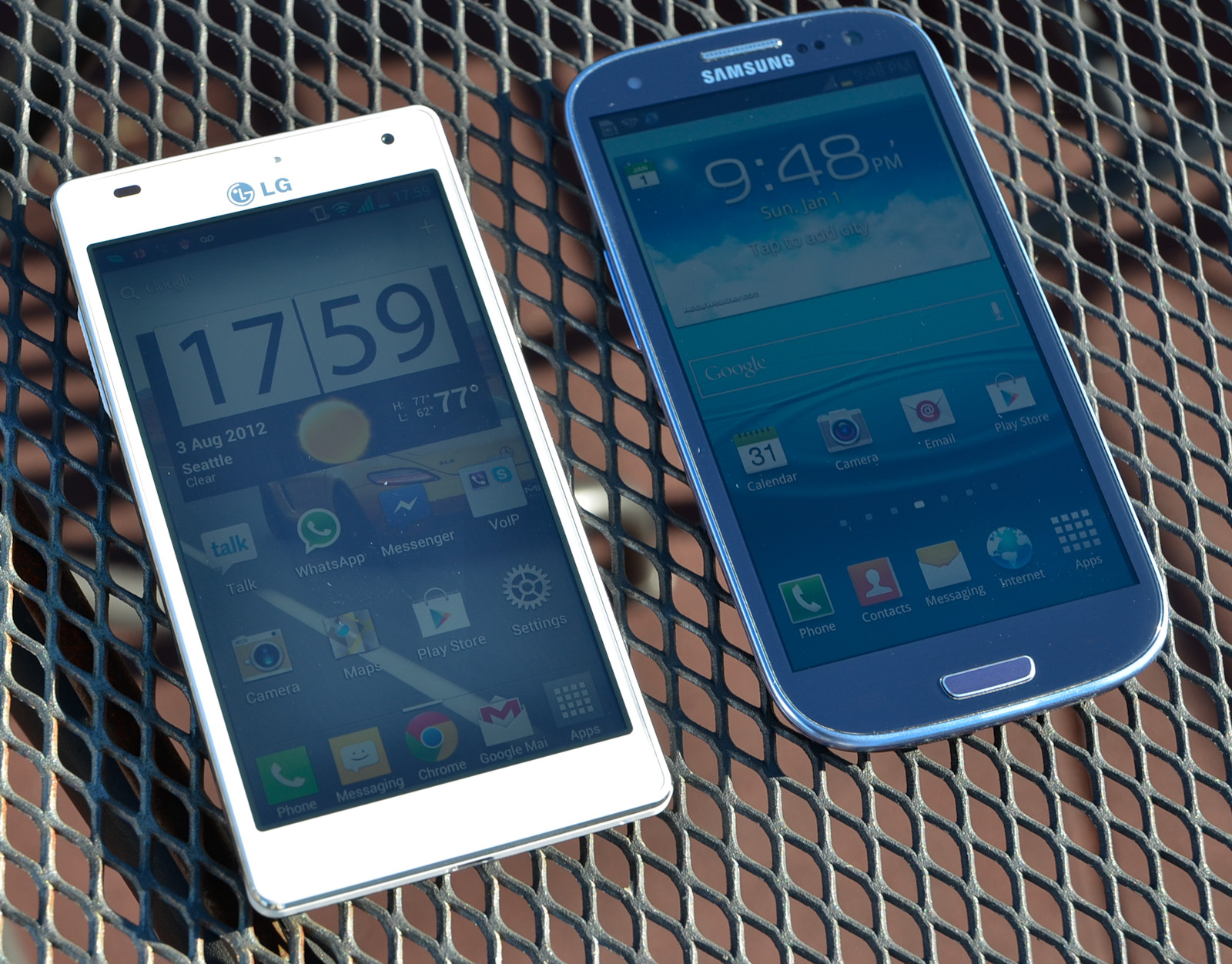
The rectangular shape helps give the O4X very compact dimensions, with minimal overhang from the 4.7” display. As display sizes grow, the amount of wasted space around the display becomes a much larger concern to maintain pocketability and in-hand usability. While HTC and Samsung went with contoured design languages to combat this issue, LG stuck to basic geometric shapes and was very fastidious about keeping the footprint as small as possible. And for the most part, they’ve succeeded. It’s smaller than both the One X and SGS3, and comes very close to matching the Galaxy Nexus (4.65” display).
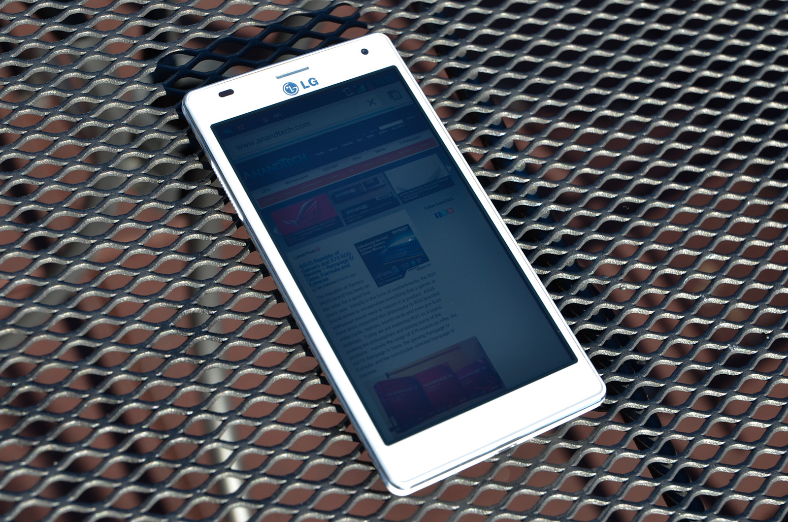
The styling is very, very clean, with minimal extraneous details. The front is entirely clean, other than the chrome LG logo, front facing camera, earpiece, and proximity sensor. There are three capacitive touch buttons (back, home, menu) that light up when touched but otherwise disappear to make it look like an unblemished piece of plastic. Having buttons appear only after they’re touched sounds counterintuitive, but you learn quickly to just stab in the general area of the button you’re going for. If you’ve ever used an Android device before, it comes pretty naturally. I do take issue with LG’s inclusion of a menu button instead of a task switcher, as I do with Samsung and the Galaxy S III. I much prefer the button layout of the GNex and HTC’s One series, with a dedicated task switching key in place of the menu button. My other problem with the O4X button layout is that the buttons are all placed very close to the screen, so it’s easy to accidentally press one of them while typing. A common one for me is hitting the space bar and the home key at the same time, which can get annoying pretty quickly. Ideally, LG would have included an extra millimeter or so, in order to give a bit more buffer room between the screen and the capacitive buttons.

The sides of the O4X HD are basically made up of two chrome rings separated by a contoured plastic center. The volume toggle protrudes from the plastic on the left side and is very easy to find by touch. The hardware button layout is dead set perfect; the power button and headphone jack are at the top and the micro-USB port is centered at the bottom, just as God intended them. I’ve gotten used to Samsung and Nokia’s fascination with putting power buttons on the right side, but it’s always a relief to get my hands on a device with everything in the right place.

The battery cover is white plastic, but not nearly as cheap feeling as the plastic used in the Galaxy S2’s battery door. It has beveled edges all the way around, giving it a bit of visual interest as well as making it easier to hold. The brushed texture also gives it an interesting feel, but contrasts weirdly with the triangular texture used on the sides and volume buttons. Removing the battery cover doesn’t really inspire much confidence in its construction, but it is at least better than what Samsung usually does, and I’ve dealt with enough of LG and Samsung devices to know that even if they don’t feel particularly solid, it’ll take more than standard operation to break the plastic. It’s reassuring to see removable batteries in the SGS3 and the O4X HD, with so many manufacturers switching to sealed batteries and unopenable devices in recent times. The Apple effect is catching on, but apparently the Koreans haven't gotten the memo, thankfully.


46 Comments
View All Comments
lowlymarine - Wednesday, August 29, 2012 - link
The chart on the first page says the Galaxy Nexus has an "ARM Mali-400" for the GPU, but I'm fairly certain it actually uses a PowerVR SGX540.lowlymarine - Wednesday, August 29, 2012 - link
Also, no version of the Galaxy Nexus has a MicroSD slot, to my knowledge. And on page 7:"from an optical standpoint it comes with what I believe is a 4P (4 plastic elements) system with a focal length of <focal>mm."
Not sure what's going on there.
Excellent review overall though. I have to agree on the button layout, it's a shame they didn't use the ICS default buttons ans instead chose to stick to a legacy menu button.
VivekGowri - Wednesday, August 29, 2012 - link
Missed a couple of things when I was switching it from SGS2 to the Galaxy Nexus. The focal length is 3.2mm - I just put in a placeholder when I was writing and simply forgot to put in the value when the review went live.Skidmarks - Wednesday, August 29, 2012 - link
It seems to have very capable hardware but is truly a dreadful looking thing IMO.Belard - Wednesday, August 29, 2012 - link
Agreed... then again, look at it this way. When a touch-screen device, such as a phone is made - everything is made around the screen. Right? That doesn't leave much room for much of anything else. Other than the size, thickness, materials, placement of buttons. If you GO BACK in time in the days of candy-bar, sliders, flip-phones - someone like SONY alone had about 60 different phones on the market at once time. Now SONY has about a dozen active smart phone designs (almost all are rectangle with curved corners) - some are quite attractive. But few are available - or they are at the SONY STORE at full price. at&t only sells 1 SONY phone. (I don't consider SONY because their track record with Android is sub-par at this time and their love for those rubber covers over the USB port which I have to fight to remove)You had different colors, different shape of buttons, different size screens. Remember the days of the LG Chocolate?
The required touch-screen kill design ideas. But looking at MC/ Samsung / SONY and NOKIA - there are style DNA that can still be applied to the shape. SONY's style tends to make the phone bulkier than it should be.
Mike0 - Wednesday, August 29, 2012 - link
Also, the International One X has 32GB NAND, not 16GB unless you're referring to the Snapdragon S4 variety which would be useless in this comparison :PMike0 - Wednesday, August 29, 2012 - link
And it's screen is Super LCD2, if you're including technical terms like SAMOLED.Mike0 - Wednesday, August 29, 2012 - link
Also also, (last one I promise :P) the latest 4.0.4 update for the One X International dramatically improves it's scores in BrowserMark (Some people are getting 125000+) and Vellamo (Over 2000 now) and probably more benchmarks so it may be worth updating your results.VivekGowri - Wednesday, August 29, 2012 - link
Yeah, I copied the table over from another review and missed a few things when I was changing them. Missed the GPU/SD card thing when I changed from SGS2 to SGN, and the NAND when I changed from One X (AT&T) to One X (Intl.) Should be fixed now though.arnoudw - Thursday, August 30, 2012 - link
The update to 4.0.4 also drastically improved battery life. Here are some tests: http://tweakers.net/nieuws/83464/update-htc-one-x-...