USB 3.2 Gen 2 Portable SSDs Roundup - Featuring the Samsung T7 Touch and the SanDisk Extreme Pro
by Ganesh T S on January 23, 2020 9:00 AM ESTSynthetic Benchmarks - ATTO and CrystalDiskMark
Most USB 3.2 Gen 2 NVMe-based SSDs claim read speeds of up to 1050 MBps and write speeds of up to 1000 MBps. Most of these claims are backed up by the ATTO benchmarks provided below. Unfortunately, these access traces are not very common in real-life scenarios.
| Drive Performance Benchmarks - ATTO |
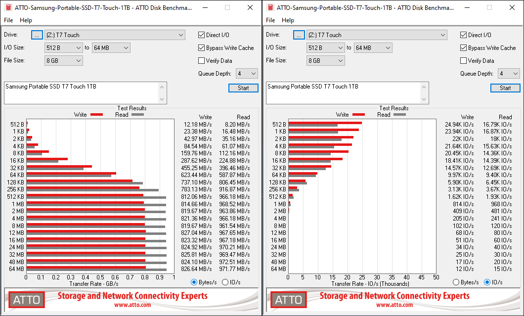 |
The 2TB OWC Envoy Pro EX USB-C tops the write charts at close to 935 MBps, with the rest clustered between 850 MBps and 900 MBps. On the read side, the drives are clustered around 970 MBps to 980 MBps.
CrystalDiskMark, despite being a canned benchmark, provides a better estimate of the performance range with a selected set of numbers. As evident from the screenshot below, the performance can dip to as low as 20 - 40 MBps for small-sized reads at very low queue depths.
| Drive Performance Benchmarks - CrystalDiskMark |
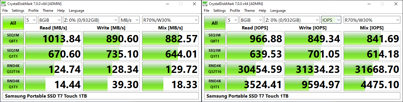 |
Read speeds saturate around 1020 MBps for most drives, and writes around 900 MBps. The T7 Touch appears to lag behind the rest a bit in all the workloads, while remaining in the same ballpark.


38 Comments
View All Comments
zebrax2 - Thursday, January 23, 2020 - link
I don't know about the others but I'm not a fan of having the benchmarks hidden inside a drop down box unless selected. I also feel that for some of the benchmark 1 or 2 charts containing all the data ,e.g. ATTO and CrystalDiskMark, would be better instead of the screenshots.chaos215bar2 - Thursday, January 23, 2020 - link
Agreed. Did I miss something, or are there no actual direct comparisons between the drives (aside from the feature table at the end)?This reads like 6 separate reviews, where I have to keep messing with drop downs to follow each one. It’s all but impossible to follow in a mobile browser. On desktop, I could at least open the screenshots side by side.
sonny73n - Friday, January 24, 2020 - link
Who reads news on desktop anymore? Unless working on PC and want to have a peek at what’s on, nobody would give up the comfort of reading while lying down on the sofa or in bed with a mobile device. Therefore, drop down comparison is useless to most readers.s.yu - Saturday, January 25, 2020 - link
Sorry, I visit Anandtech almost exclusively on my PC.dontlistentome - Sunday, February 2, 2020 - link
This forum is increasingly populated by people with zero concept that other people may think or do things differently to them. Guess it's a microcosm of the wider no-platforming world.My advice? Spend a morning learning keyboard shortcuts and you'll understand why we oldies still prefer to browse on desktop rather than mobile when doing anything other than *really* casual browsing.
bigboxes - Monday, February 3, 2020 - link
Yeah, reading this on mobile platform sucks. Desktop is way more comfortable. Then again, my workstation is fairly ergonomic (and badass!). Get off the couch if you want to live to old age.Sivar - Thursday, February 6, 2020 - link
I find mobile devices to be extremely annoying for web browsing. Small screen, slow CPU, extremely limited browser plugins, frustrating data entry, more difficult copy/paste.I have a tablet and smart phone, but my web browsing on them tends to be light and often only directs me on what to read later on my "real" device.
JanW1 - Monday, January 27, 2020 - link
That was my first thought on this review as well. Plus, the scales of the charts hidden behind the dropdown menu are all different for no good reason. This almost looks like every effort was made to prevent readers from comparing the drives. Just let the throughput scale on all charts go to 1000MB/s and the temperature scale to 70°. This fits the data from all drives nicely and readers can see the differences in a glimpse.alphasquadron - Thursday, January 23, 2020 - link
Yeah I agree as well. Don't it was like this previously or maybe it was a different reviewer.ganeshts - Thursday, January 23, 2020 - link
Would it help you if I were to keep the 'Expand All' option as the default and allow readers to use the drop down to 'compress' it down to 1 graph / make the analysis text visible along with?As for the ATTO / CDM 'graphs' instead of 'screenshots' - the aspect I need to trade off with is the number of data points. For example, CDM has 12 sets per drive (or 24 if you include the IOPS version also). ATTO has more than 20 sets * 2 (R/W). That would be 64 graphs. It doesn't make sense to have that many graphs for two synthetic benchmarks.