The Xiaomi Mi Note Pro and Mi Note Review
by Joshua Ho on September 11, 2015 9:00 AM ESTSoftware: MIUI 6
When it comes to Android, there are a wide range of opinions on what the “best software” is. One common opinion is that stock Android is the best for the end user. This is probably the most common one, but there are others that prefer some of the more complete reskins like TouchWiz. Given how intensely subjective this aspect of user experience is, I think it’s worth saying right now that while I don’t have a problem with AOSP UI/stock Android, I don’t think it’s the best Android experience possible. AOSP UI out of the box is often missing some rather simple features like the ability to rearrange quick settings or the ability to easily see the current battery percentage of the phone. Of course, this doesn’t mean that it’s okay for an OEM to completely ignore all Android design guidelines, but I’m definitely open to the idea that a deep UI skin can improve the Android user experience when done right.
In the case of both the Mi Note and Mi Note Pro, Xiaomi ships MIUI 6 on both devices, although MIUI 7 has just started rolling out with some incremental improvements over MIUI 6 that include higher performance and lower power consumption. Anyone that has flashed custom ROMs before has probably heard of MIUI as it was ported to a number of devices, but for those who don’t bother with such things it’s pretty safe to say that MIUI is a very different experience from stock Android or even most OEM skins.
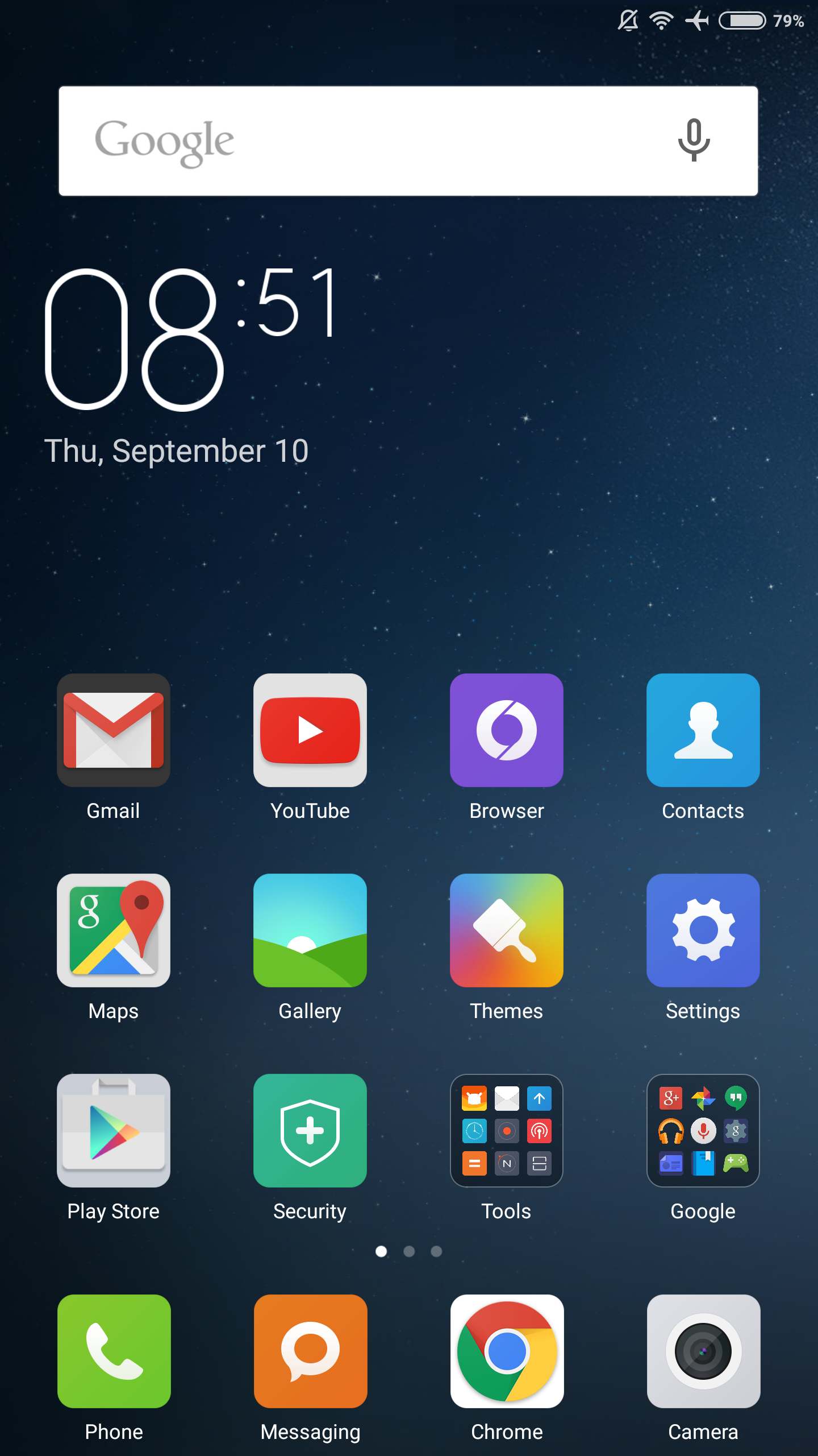
Probably the easiest place to start is the launcher. Unlike most Android phones we’ve reviewed, there’s no separate app drawer. For people switching from iOS this is relatively normal, but anyone used to Android will probably not be used to this change. Personally, I feel that this isn’t too bad for someone who is using Android for the first time, but when I used MIUI for the first time as far back as the Gingerbread era I found it to be pretty frustrating to deal with an OS that dropped a few hundred app icons onto various homescreens with no real organization. If you’re switching from another phone and your only option is to restore using Google’s backup mechanism, this is the experience you’re probably going to have.
However, if you start with no user-installed applications like I did for this review this lack of division between homescreen and app drawer ends up manageable. One could argue iOS faces a similar problem, but with iOS you’re effectively only dealing with an app drawer, and organization is preserved across devices with iCloud backup. You can’t come from another iOS device that does things differently, so there’s no real problem here.
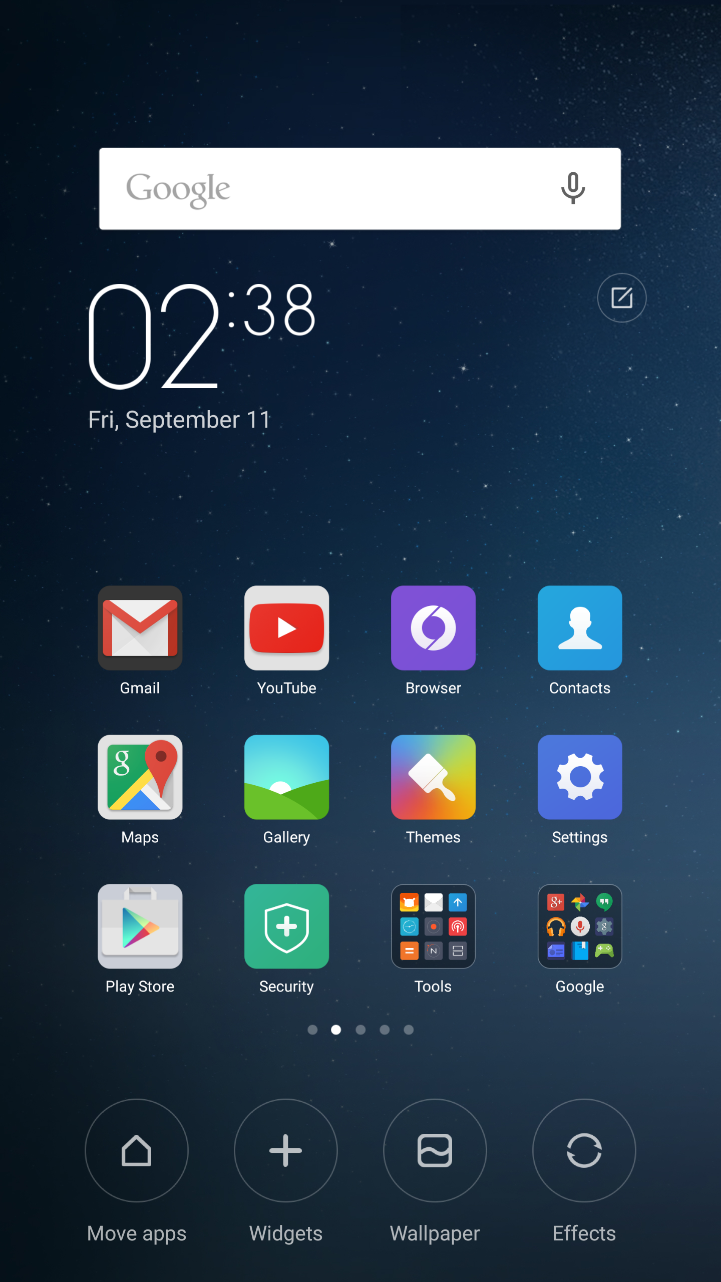
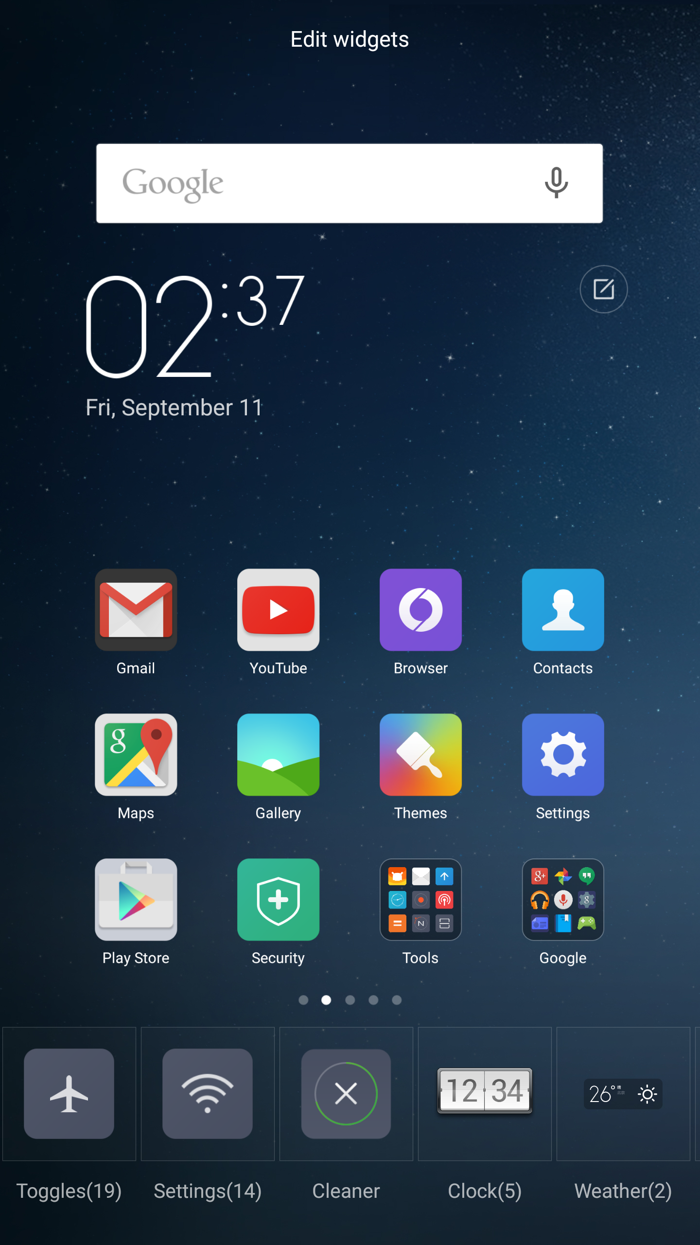
The launcher itself has a good selection of widgets that the average user will use and find useful, but the problem here is that third party widget previews don’t seem to work. As a result, trying to add app widgets to the homescreen can be more difficult than it needs to be. Other than this minor problem, I actually found a lot to like here. The editing screen is brought up with a natural pinch to unzoom, and mass movement of apps is easily accomplished by tapping app icons on the homescreen into a temporary drawer and tapping/dragging them into a new screen. It’s also possible to set the transition effect from one page to another, but I personally don’t see a lot of value in anything other than a simple slide transition.
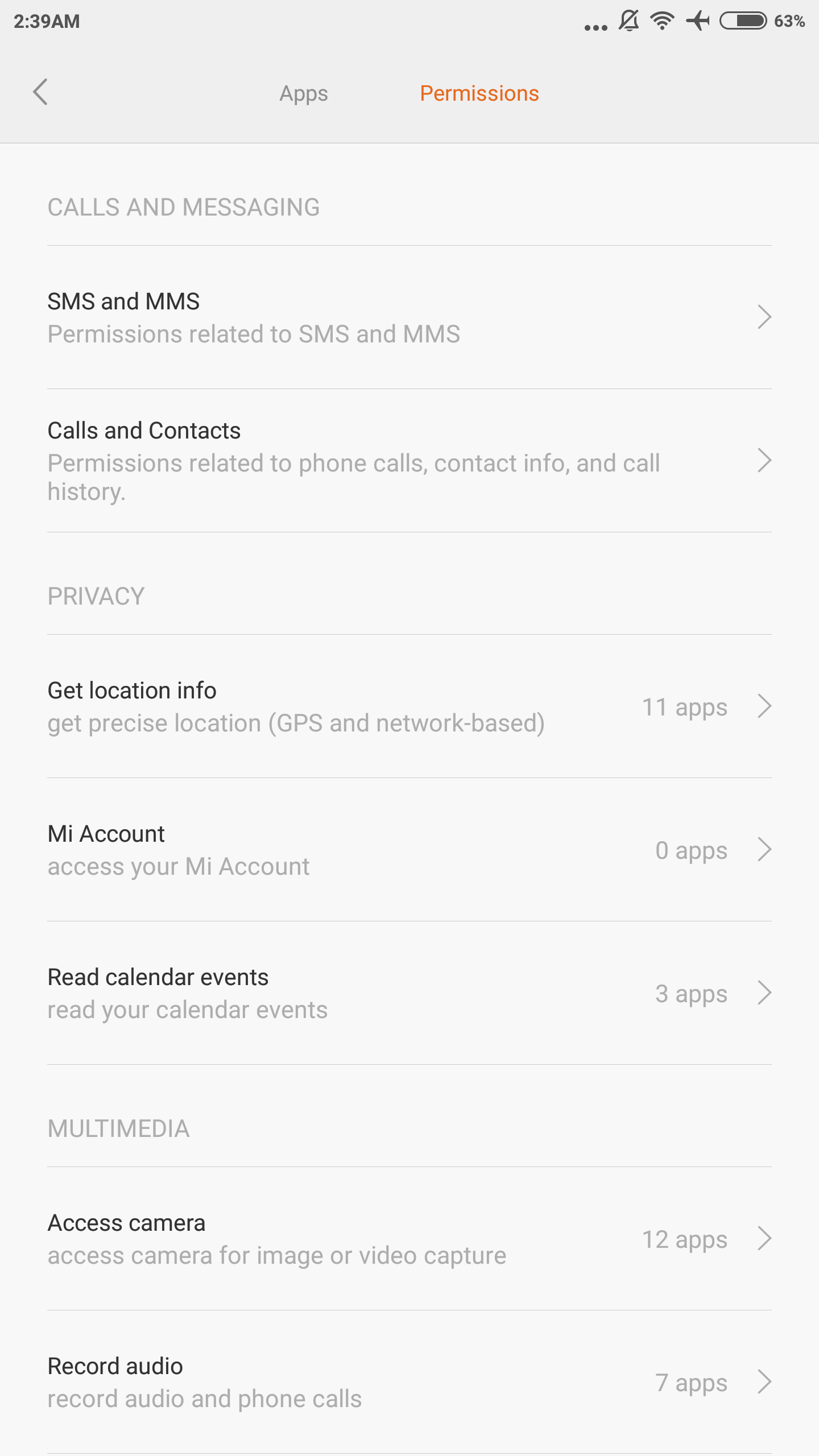
Moving past the launcher, there’s a lot that I enjoyed in MIUI. For example, Xiaomi has included an extensive permissions management system, which is surprisingly advanced in terms of what permissions you can toggle on and off. It’s possible to enable and disable applications from starting automatically, along with management of any permission that could potentially affect privacy such as changing system settings, recording audio/video, retrieving location, and accessing contacts.
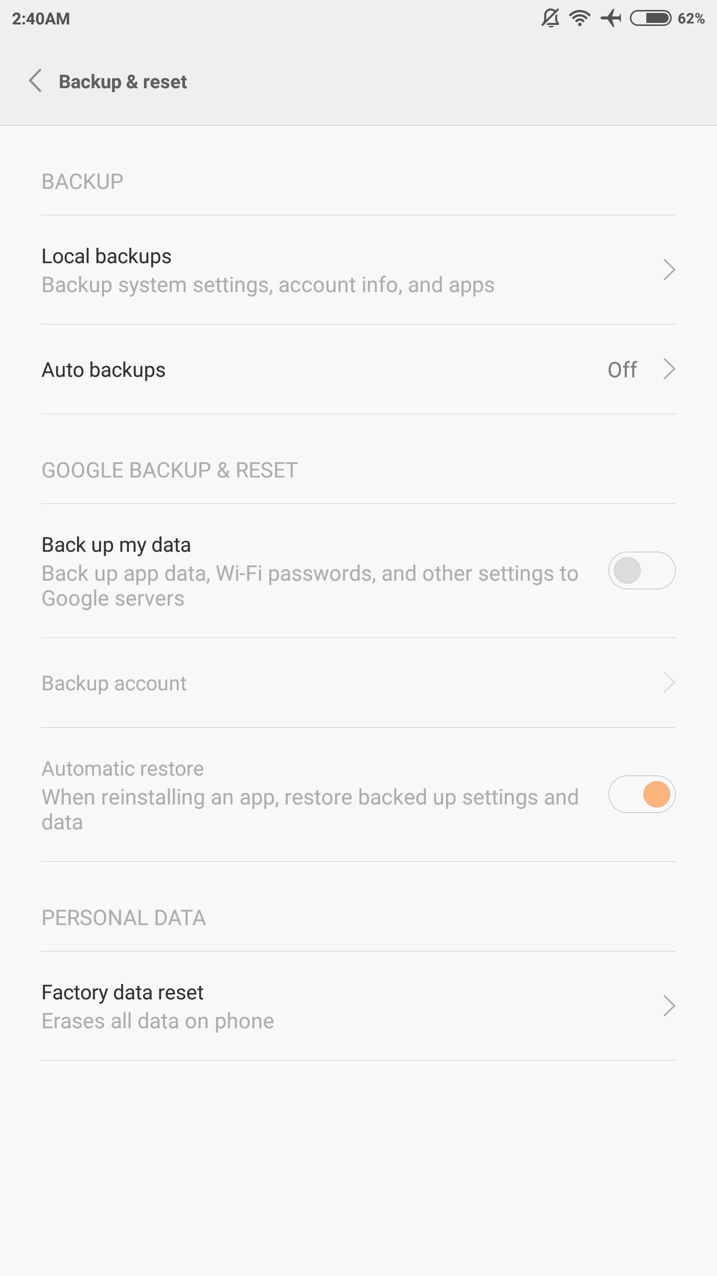
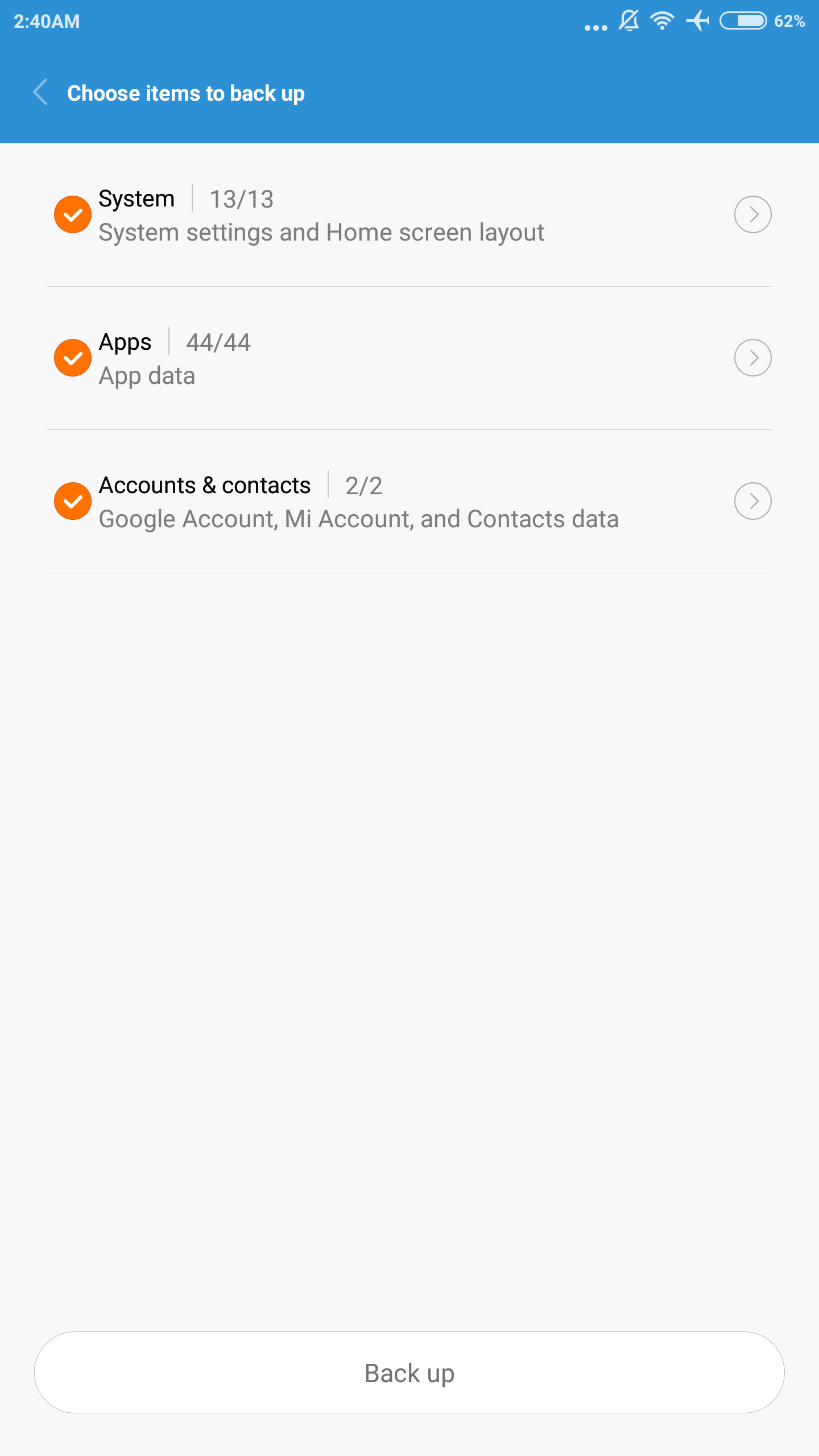
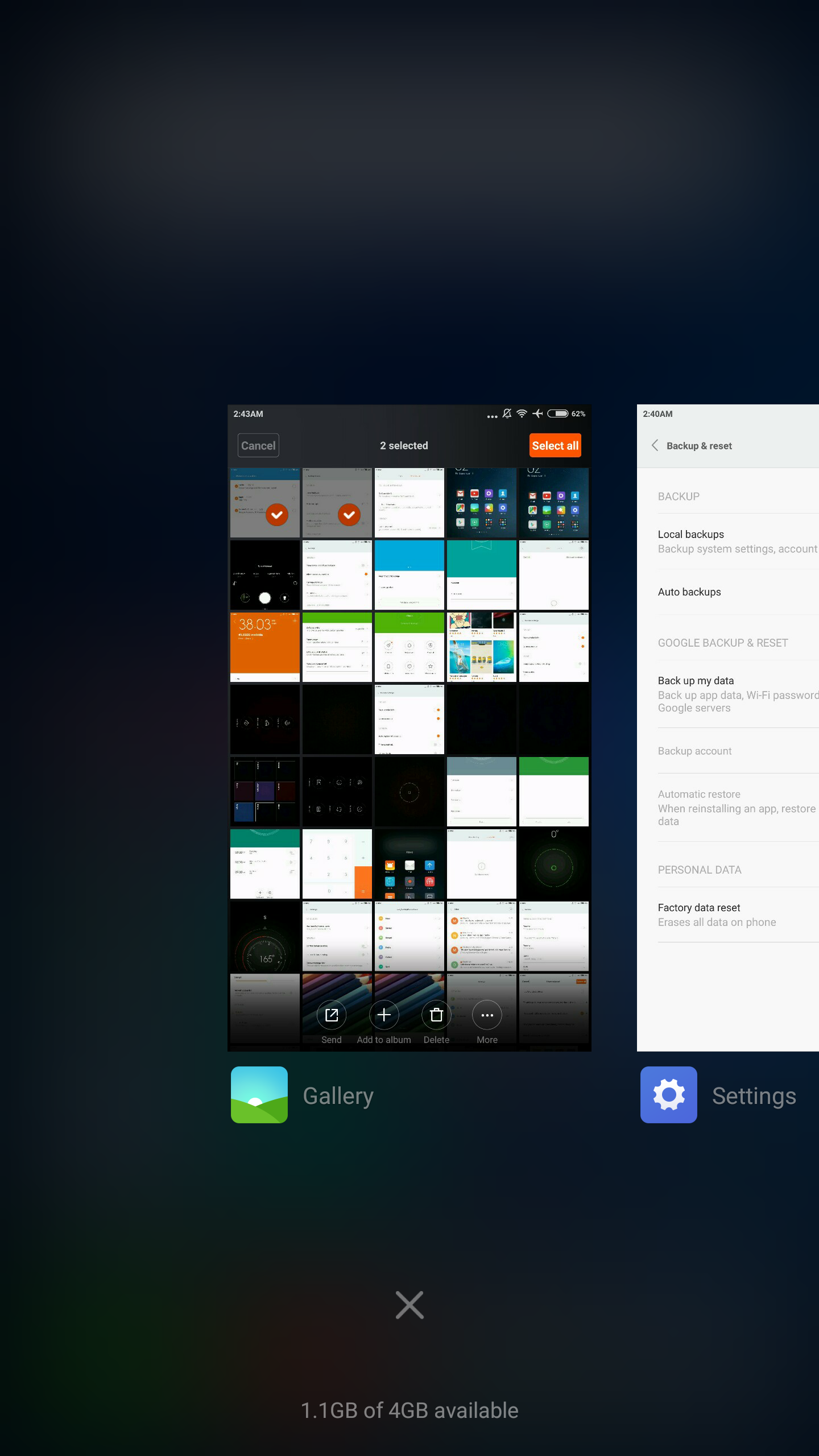
There’s also both local and cloud backup options, which saves things like homescreen layout and third party app data. I’ve definitely seen OEM UIs that ship with cloud backup options, but nothing that allows local backups that preserve third party app data other than Huawei’s EmotionUI. I’ve consistently found Android to have a rather poor user experience in this regard, so it’s good to see that Xiaomi has relieved a lot of the pain points in the backup experience when you stay within the Xiaomi ecosystem.
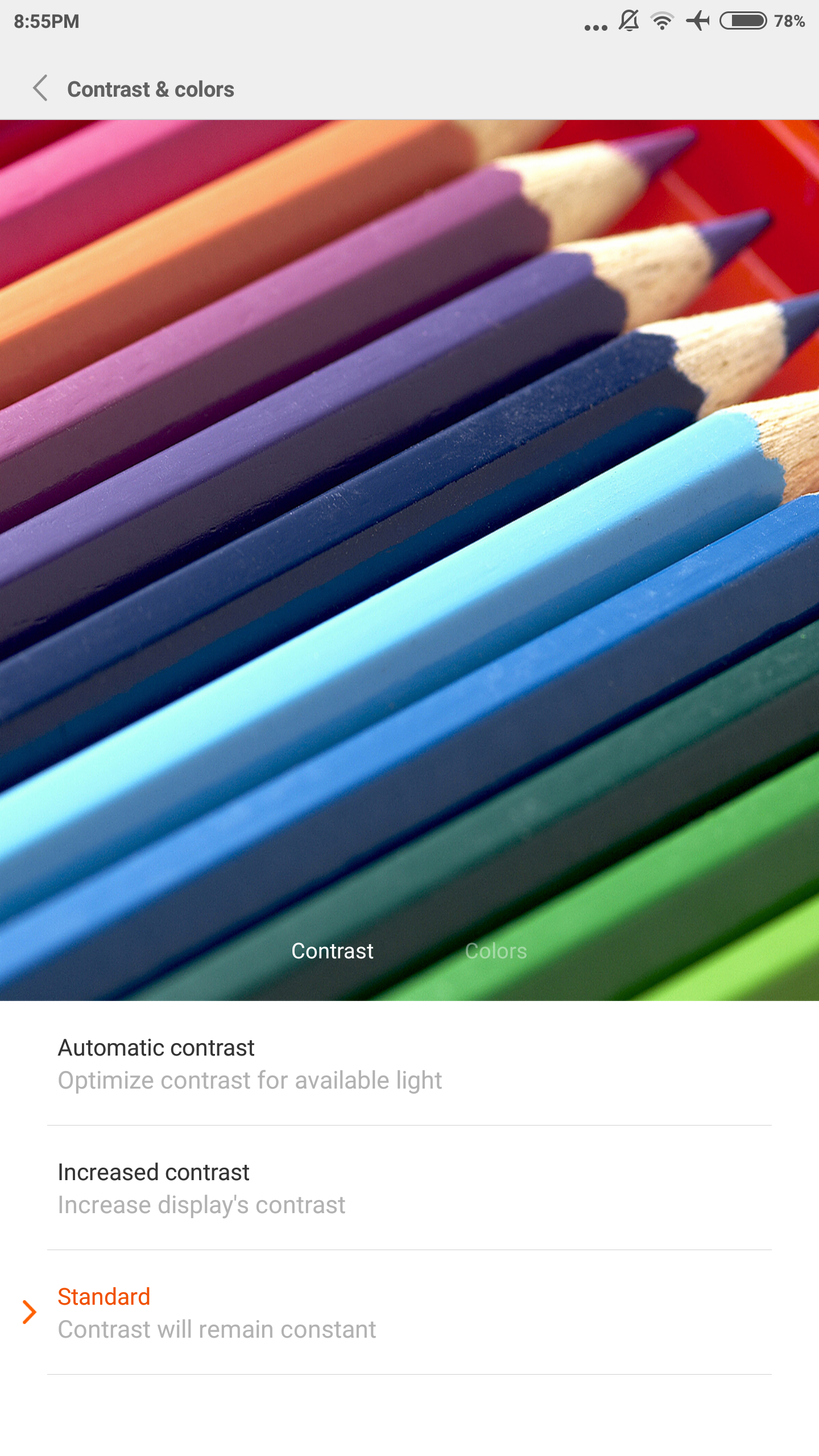
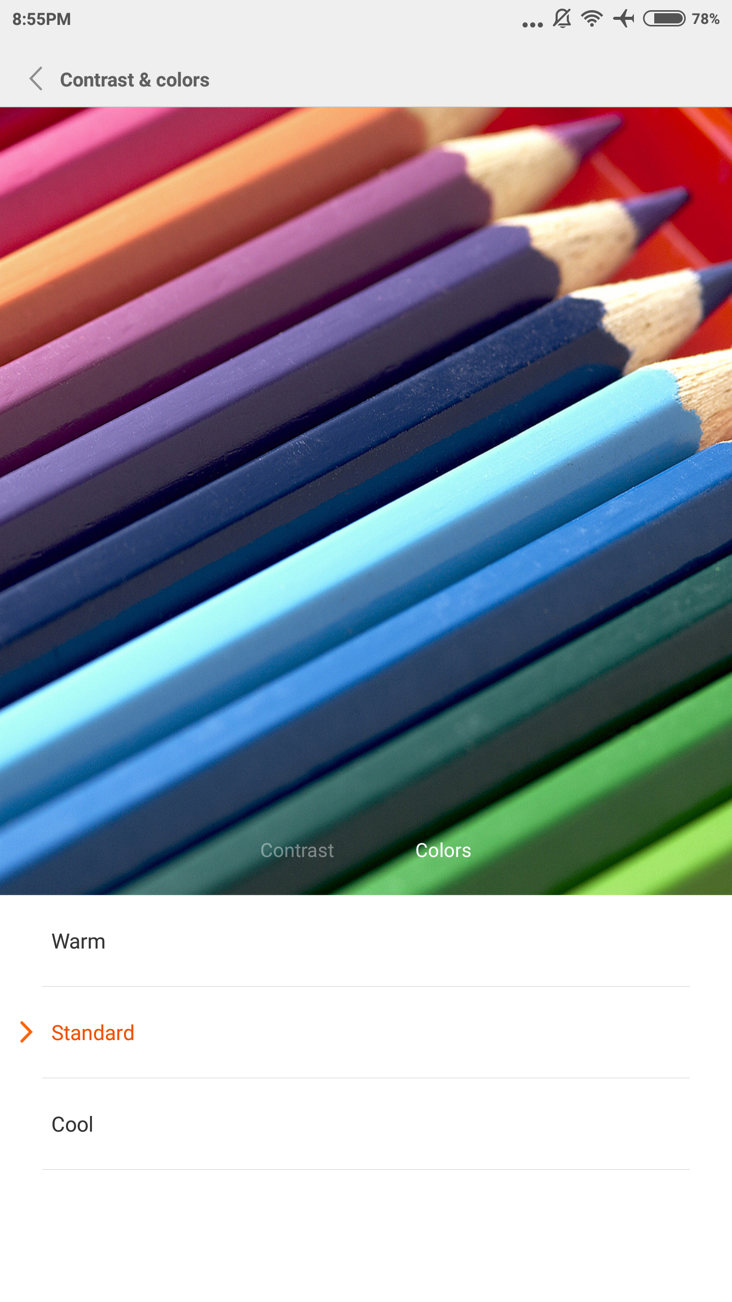
The display settings are also much better than anything else I’ve experienced in the Android ecosystem, as there are options for automatic, increased, and standard contrast which correspond with gamut and dynamic contrast effects, along with the ability to set a warm, neutral, and cool white balance for each mode. This effectively covers just about every possible preference an end user could have in terms of white point and color calibration without the annoyance that comes from a unitless slider that seems to be quite popular with many Android OEMs.
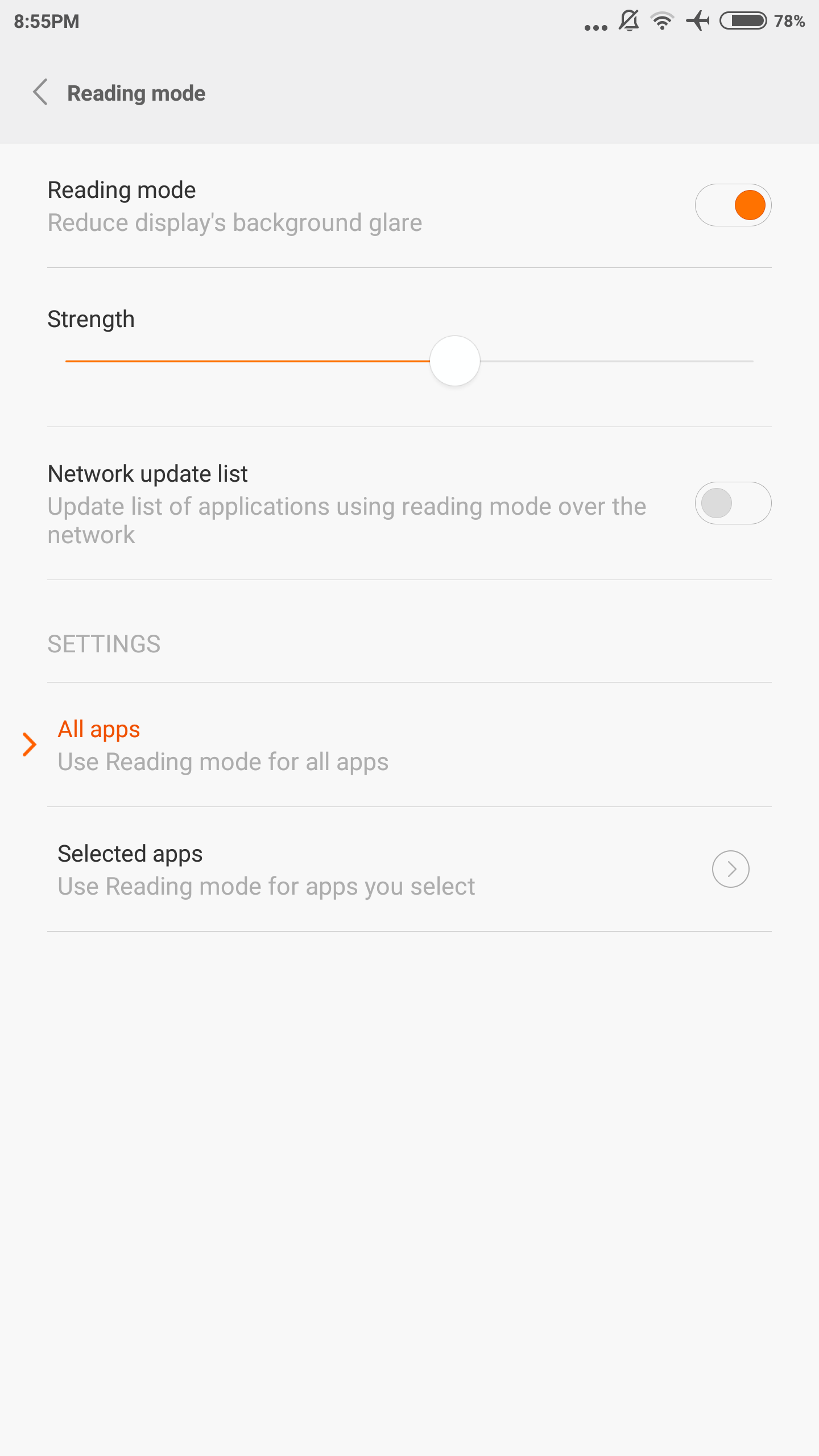
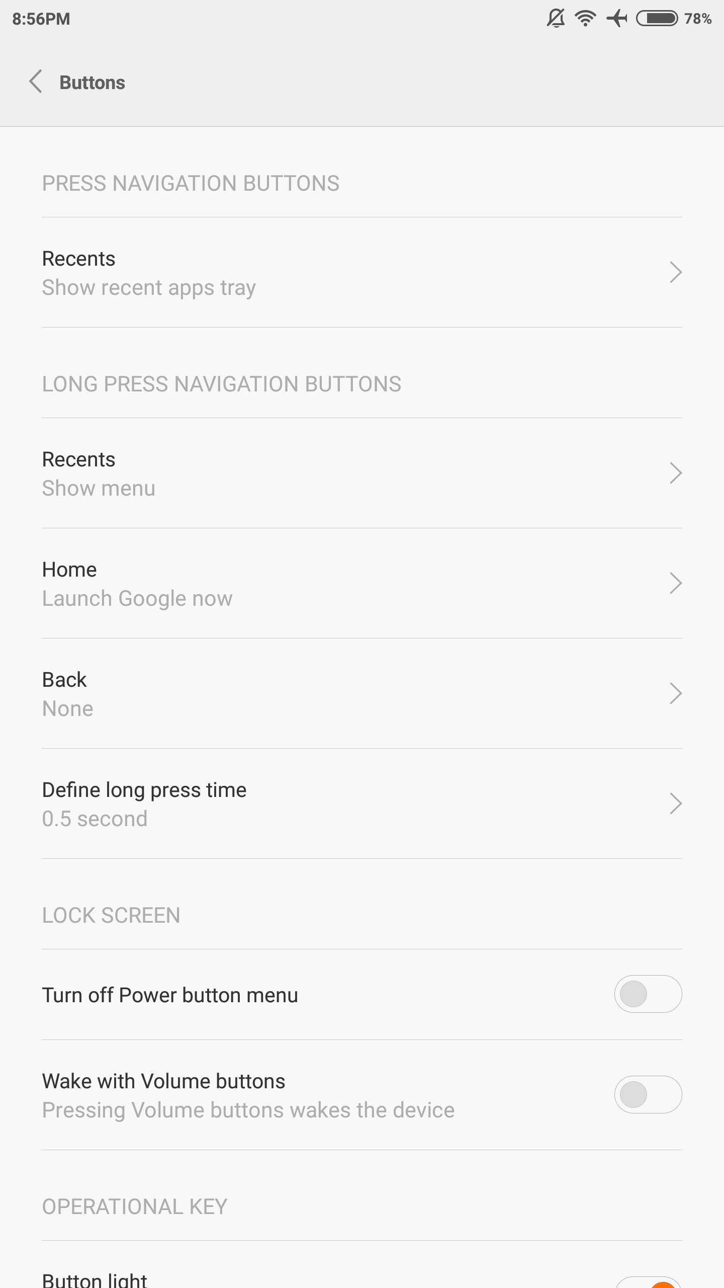
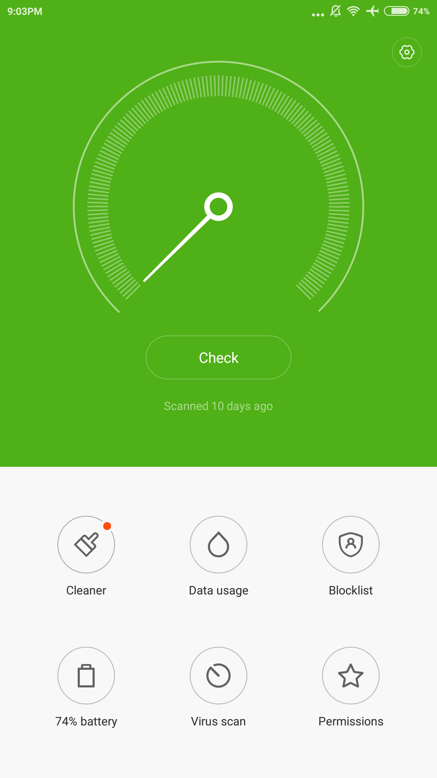
Overall, MIUI is really more interesting because of just how well-polished the UI is in terms of smart features. The UI is distinctly different from Android, but in general app design is internally consistent, aesthetically pleasing, and easy to learn. Simple UI additions like automatically going to quick settings when the notification drawer is empty and fast flashlight access on the lockscreen help to make UI navigation faster as well. It’s also great to see things like a minimal battery percentage indicator out of the box. There are also options to select what function the capacitive buttons serve based upon long/short press with an option to set the long-press delay.
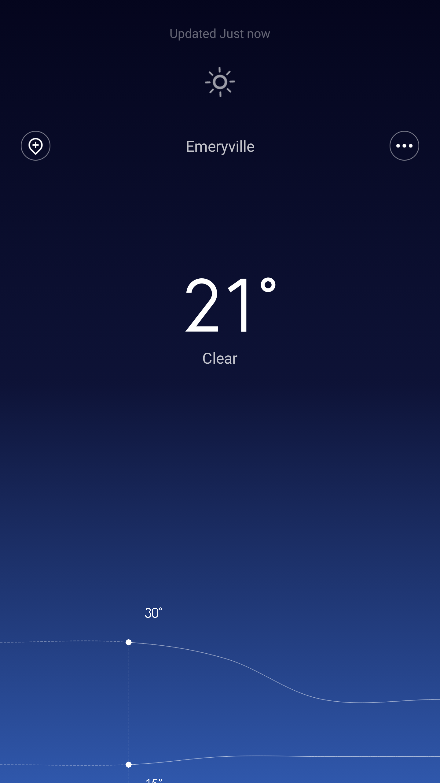
However, MIUI isn’t necessarily perfect. There are some problems with apps that seem to hide their settings by requiring a long-press on the multitasking button to access app settings. The continued use of the menu button symbol on capacitive buttons is also confusing when a short press of the menu button acts as the multitasking button. The weather app strangely also lacks any semblance of settings for regular app refresh or any way to change units to Fahrenheit. Other than some minor app design problems though, I never really had any problems.
Of course, the elephant in the room here is the rather significant resemblance MIUI has to iOS. In this regard, I think it almost goes without saying that MIUI appears to be drawing at least some design inspiration from iOS. I’m not part of any trade commission or remotely interested in the legal aspects of this problem, but something as simple as the settings app immediately gave me an intense sense of déjà vu from how familiar it is. Folders also have a similar zoom effect which is distinctly out of place when almost every Android UI simply overlays app folders over the homescreen rather than zooming into a distinct folder view. The multitasking UI by default is arguably different as it only shows app icons and the app name, but as soon as you pinch to zoom to see a thumbnail the resemblance to iOS’ task switcher is hard to ignore. Even the contacts app uses the same scrollbar design as iOS.
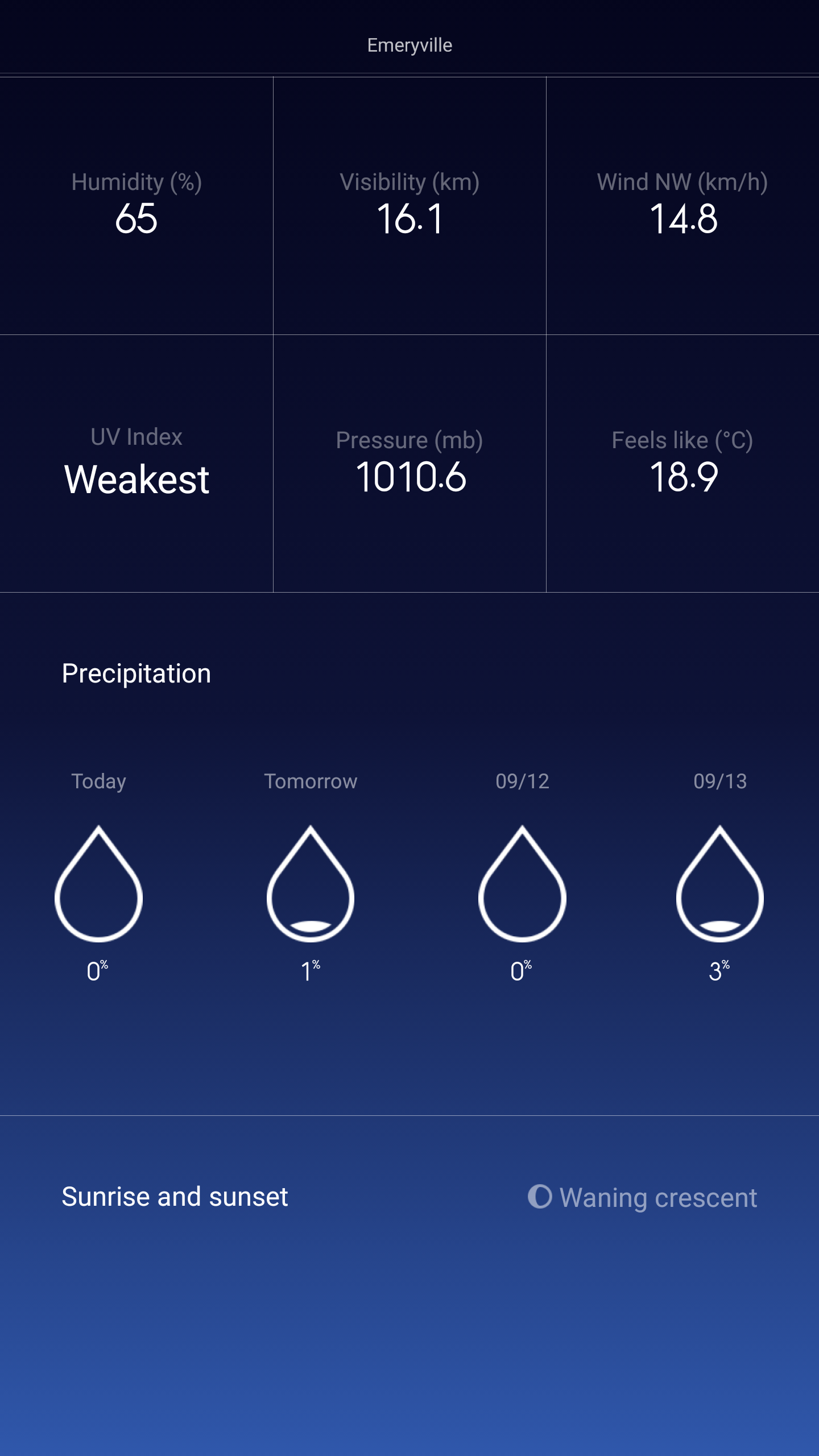
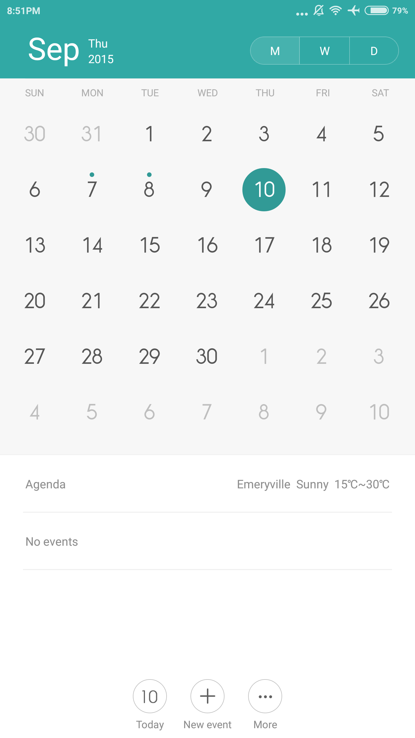
Even if there is inspiration from iOS at times, it’s clear that MIUI isn’t just a straight rip-off of iOS. App design in areas such as the clock application shows a distinctly different layout with unique animations. Similarly, applications like the voice recorder is clearly distinct from what you would get from iOS. Other areas like the weather app are clearly not a straight copy of iOS as the design and information presentation is clearly different. At a glance the calendar app appears like it’s possibly a straight copy of iOS, but the actual workflow and design is quite different in practice. For example, instead of a simple month to month overview and the ability to see events by each day, an agenda is presented based on a month, week, or day view. Similarly, the notes application might have some superficial resemblance to the notes application on iOS, but functionally speaking it’s obvious that the MIUI version of this basic application has a very different workflow and method of navigation.
Overall, I found a lot to like when it came to the MIUI. I suspect that MIUI will be somewhat divisive because of how divorced it is from a lot of Android conventions. However, within the skin itself I found a number of useful additions to Android from a functional perspective, and a generally well-designed and cohesive UI. It’s possible to level criticism at Xiaomi in some regard for looking a bit too much like iOS at times, but to broadly characterize MIUI as a blind iOS copy ignores a significant portion of the UI where it’s clear that MIUI is unique. I still think an “ideal” Android skin should try to maintain Android UI conventions like Material Design, but MIUI is probably the best example of a total conversion Android UI done right. Anyone who doesn’t already know what they want from an Android UI will probably find a lot to like with MIUI.


94 Comments
View All Comments
DigitalFreak - Friday, September 11, 2015 - link
You guys need to say if a phone is a US model up front. I'd rather not waste my time reading a review of something that's only available in Asia/Europe.Daniel Egger - Friday, September 11, 2015 - link
I agree but for the exact opposite reason. But on the bright side the non-availability of subsidised US versions means that we we non-US readers don't have to have to look up the unsubsidised prices elsewhere to actually get a feel for the real price...Jimbo - Friday, September 11, 2015 - link
Yet your eventual cost for the very same hardware is always more, so how is that a "bright side" again?Daniel Egger - Friday, September 11, 2015 - link
I've no idea what you're trying to say. I applaud every attempt at providing comparable data: When AT reviews a laptop they'll tell you the MSRP (and street price), when they look at a phone they'll typically tell you some bullshit subsidised price which has only a meaning in the US and nowhere else in the world (and also only if you're actually looking to buying the device on contract).mkozakewich - Saturday, September 12, 2015 - link
I really wish they'd stop doing that. Because of stuff like that, I'm sure most people don't realize their phones are worth more than a few hundred dollars.duploxxx - Friday, September 11, 2015 - link
order this phone through web so available everywhere. reading something on technology is wasting time? time for you to stay in the apple store......DigitalFreak - Friday, September 11, 2015 - link
I'm the furthest thing from an Apple fan you'll find, moron. I'm not interested in buying a phone that most likely won't work on many of the US bands.You, on the other hand, should spend less time reading about technology and focus on learning the basics of the English language.
jordanclock - Friday, September 11, 2015 - link
Instead of being ass, you could just look up the available bands on a site like gsmarena. Not every product reviewed on Anandtech is going to be applicable to you. In this case, the phone does not support LTE on any US carriers but should support HSPA+ on ATT and T-Mobile.DigitalFreak - Friday, September 11, 2015 - link
As a service to their readers, all AT needs to do is add one sentence. As for the rest, when someone attacks me they get it right back.Have a wonderful day.
Vorl - Friday, September 11, 2015 - link
I agree. They very rarely review anything that isn't for consumption in the US. I would also rather not waste my time reading about something that isn't available. Yes, it's a waste. There isn't anything here that's ground breaking tech wise, so nothing to "learn". It's just a matter of how they put the package together. if isn't nothing I can use, why would I care?