Office 2016 And Office Universal Apps Revealed
by Brett Howse on January 22, 2015 6:20 PM EST
As if yesterday’s Windows 10 announcements were not enough news out of Redmond this week, the Office 365 team leveraged the Office Blog to detail the upcoming version of Microsoft’s productivity suite. Office 2016 will be the next desktop suite, optimized for the keyboard and mouse, and it should be available in the second half of 2015. On the Windows 10 theme though, the new Office universal apps have been detailed, and will be available across the desktop, tablet, and phone form factors.
The styling is very similar to the Office for iPad and Android apps which have launched in the last while, but these will be universal apps, so the experience should be very similar across the Microsoft platforms. The Outlook Mail and Outlook Calendar apps will be the replacement for the Mail and Calendar apps on both the desktop and the phone, which is a good thing for consistency. We are not sure if this will be in the first Technical Preview for the phone or not, but hopefully it is so we can get an earlier look at it.
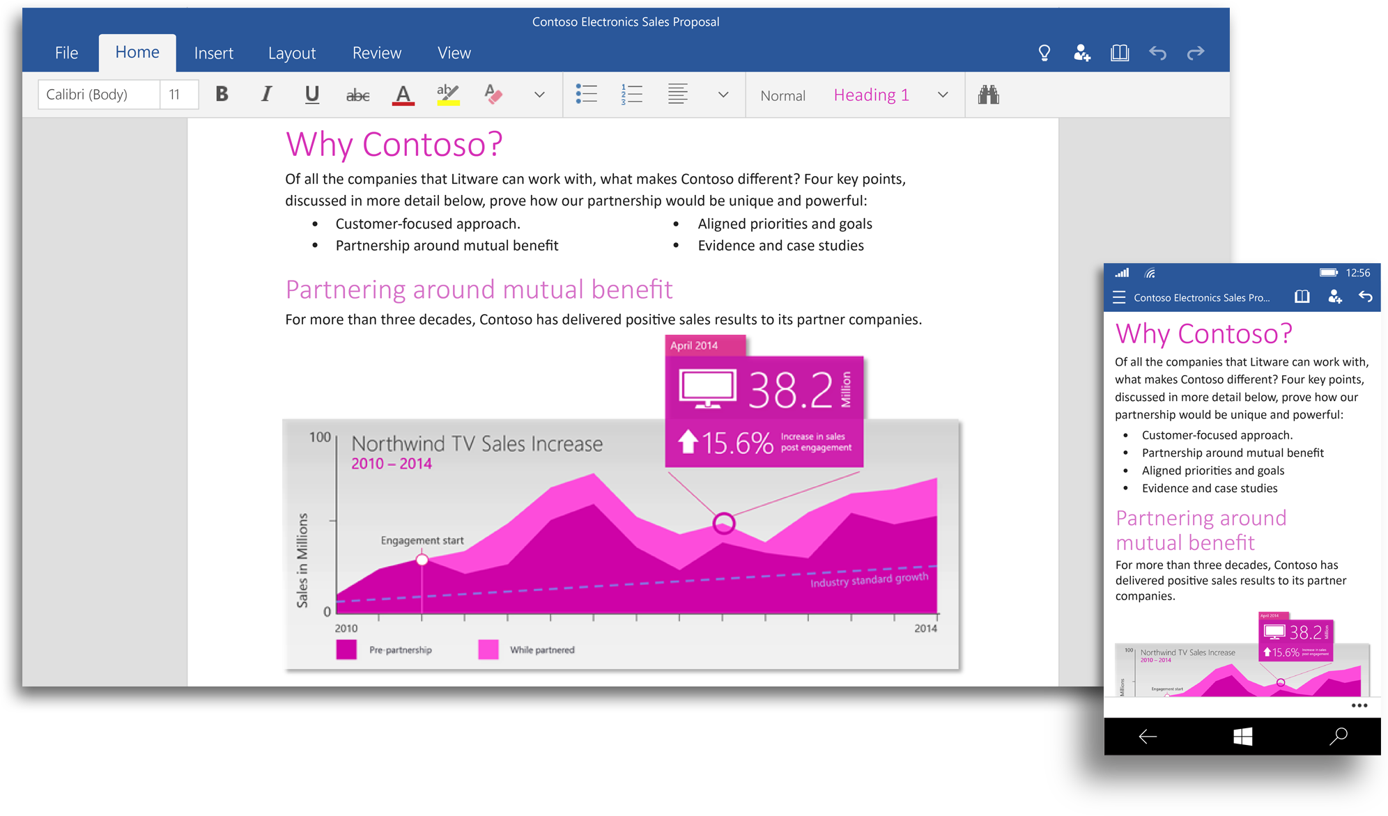
“Word for Windows 10—Create and edit great looking documents with Word. Review and mark-up documents, then share your work with others to collaborate in real time. The new Insights for Office feature (powered by Bing) in Read mode brings additional online resources like images, web references and definitions right to you in your reading experience.”
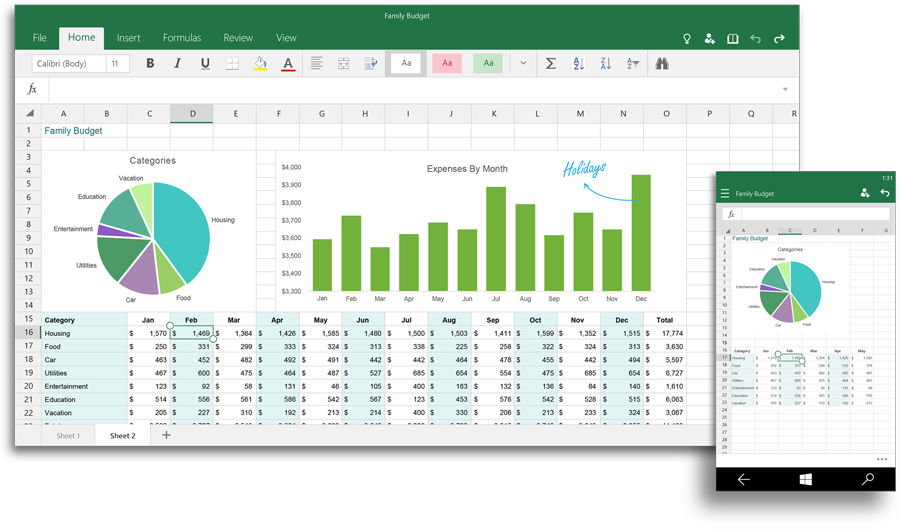
“Excel for Windows 10—Use Excel to create and update spreadsheets and gain new insights as you analyze data and visualize it with charts. And new touch-first controls shine in Excel, you won’t even miss your keyboard and mouse when selecting ranges of cells, formatting your pie charts or managing your workbooks.”
“PowerPoint for Windows 10—Create and edit beautiful presentations with PowerPoint. Then use Presenter View to prepare and present with confidence, even use Ink Tools to annotate your slides in real time so your audience really knows what you are talking about.”

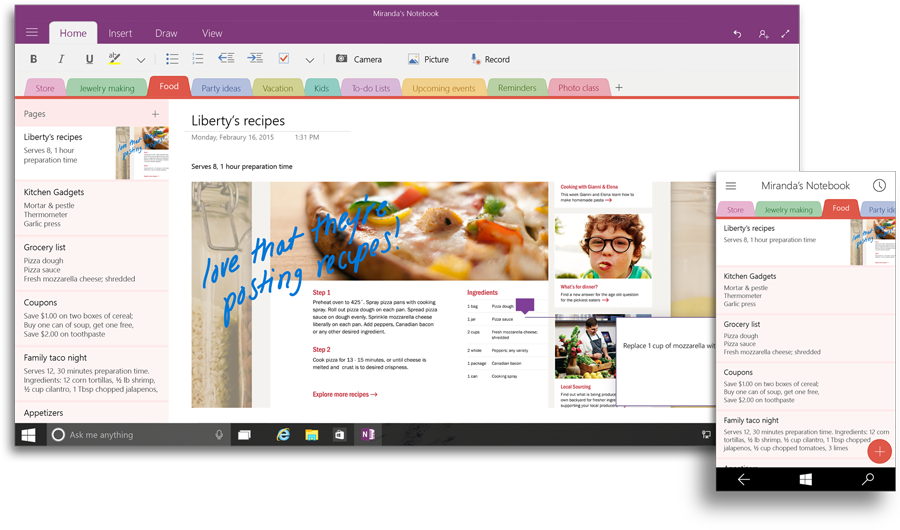
“OneNote for Windows 10—Capture all your thoughts, ideas and to-do’s with the new version of OneNote. Getting things done with your friends, classmates and colleagues has never been easier with shared notebooks–now with the consistent Office ribbon experience.”
“Outlook Mail and Outlook Calendar for Windows 10—Crafting emails has never been easier or more powerful, with the familiar and rich capability of Microsoft Word built into the authoring experience. Simply insert tables, add pictures and use bullets and color to get your point across. Keep up with your inbox with new touch gestures that help you read, sort, flag and archive your mail.”
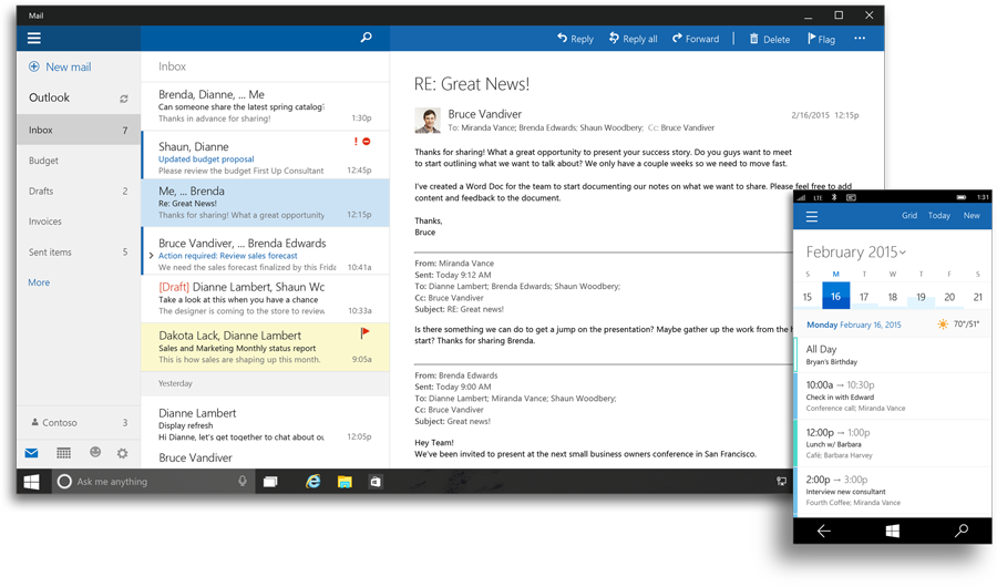
As these are just screen shots, final judgment will have to wait until the apps are made available to preview testers, but we can still glean some information from the images. First, the Outlook client is very much similar to Outlook.com, which once again improves consistency across the platforms. The ribbon is front and center on all of the other apps. They are very much like the iOS and Android versions, which should make for a great experience.
All of the apps have a common feel, and they look like a great update. The OneNote update in particular adds a lot of functionality to the Windows Store version of the app that exists now. Windows Phone will gain a lot of functionality over the existing Office integration. After a 2014 of Microsoft focusing on competing platforms, users of its products should welcome these updates. Pricing has not been revealed, but it is likely that they will be similar to the other mobile platforms where basic functionality is available for no cost, and an Office 365 subscription is required to unlock all features.
Source: Office Blog.


27 Comments
View All Comments
inighthawki - Monday, January 26, 2015 - link
I guess you guys have never used small taskbar icons with "never combine" buttons where it actually does get hard to differentiate between three blue icons with a tiny white letter at quick glance.MrSpadge - Friday, January 23, 2015 - link
Haha!CaedenV - Thursday, January 22, 2015 - link
if it bothers you that much a simple modification or two can link the icon from old Outlook to the new one... not that hard.djscrew - Friday, January 23, 2015 - link
I have to agree, 5 blue applications seems a little stupid. They could make it orange at least...TormDK - Friday, January 23, 2015 - link
The colours chosen is due to people with sight issues, so in case you are wondering - thats why.AnnihilatorX - Friday, January 23, 2015 - link
That explains BSOD!mrd0 - Friday, January 30, 2015 - link
yeah...so they chose blue...one of the colors more difficult for the human eye to sharp. Notice all the blue signs everywhere and how easily distinguishable they are...esp. when compared to other colors. Ha, the choose blue to help those with sight issues...krutou - Friday, January 23, 2015 - link
Don't forget, OneDrive is blue too.mebby - Friday, January 23, 2015 - link
My dog is blue too.kf27fix - Friday, January 23, 2015 - link
I miss the old menu bar system... All functions with long descriptive names, not taking unnecessary screen real estate.