Nokia Lumia 521: Quality Smartphone on an Extreme Budget
by Vivek Gowri on August 8, 2013 1:08 AM EST- Posted in
- Smartphones
- Nokia
- Mobile
- windows phone 8
- Lumia 520
- Lumia 521
I was surprised to see that the 521 (and 520) had an IPS display when the specs were finalized, because I fully expected the display to be one of the biggest sacrifices made for the sake of the budget. I suppose it’s not too much of a surprise, given that the 620 has quite a good display.
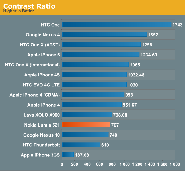
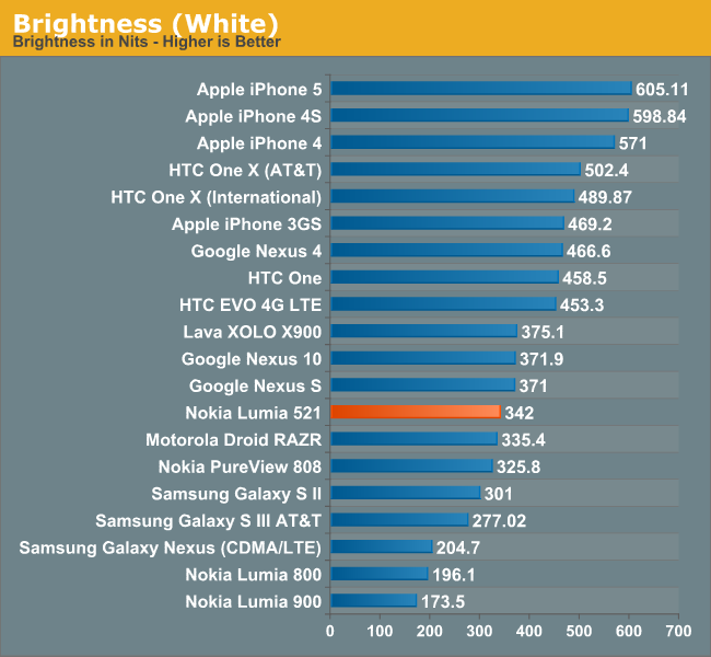
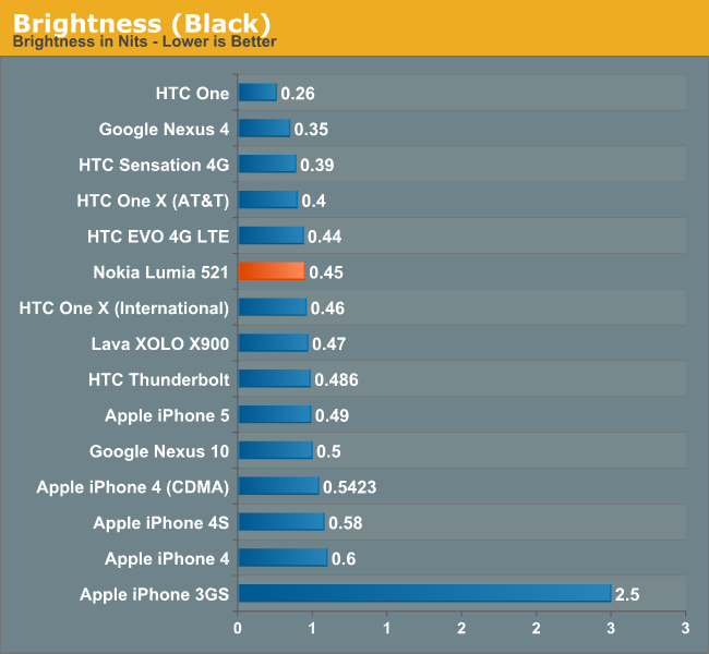
In person, the 521 display is pretty middling. It’s not a bad panel, but it’s not that fantastic either. Maximum brightness isn’t that great at 342 nits—that’s decent enough for most situations though not quite bright enough for comfortable viewing in broad daylight. The black levels aren’t anything to write home about either, so contrast ratio is pretty low by the standards of the phones we typically look at, though its worth pointing out that we focus primarily on far higher end smartphone hardware. Compared to a contrast ratio chart from a couple of years ago, the 521 is about average. The white point of 6336K is very close to neutral, and color reproduction is pretty solid as well.


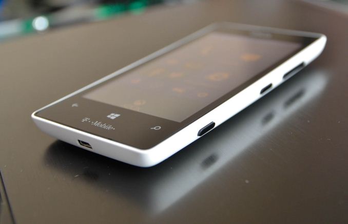
 What kind of kills the 521 display experience though isn’t the panel itself, since that’s pretty decent; it’s the gap between the LCD and the glass. That turns what would be a very respectable viewing experience into an ultra reflective mess anytime you venture outdoors. As a result, you end up wanting to crank the display brightness higher than normal (which is why I rarely used the automatic brightness setting). The extra glare brought on by the air gap is rather distracting and ends up being quite the downer in a lot more usage scenarios than just outdoor. In office-style overhead lighting, too, the glare can be quite terrible and generally ends up degrading display quality by a noticeable amount.
 Given the price point, it’s hard to fault the 521 too much and I must admit that I have somewhat of a skewed perspective. When you’re used to carrying a One, an S4, or another device with a screen of that caliber, the step down to a far lower quality WVGA panel seems pretty drastic. But the colors are vibrant, viewing angles are predictably stellar, and overall the panel looks pretty good, so there are a lot of positives to focus on.
The brightness controls for Windows Phone are a bit finicky—you only get four options: low, medium, high, and automatic. The brightness steps are pretty reasonable, starting with low at 74 nits, medium at 191 nits, and high at 342 nits. There is no iOS or Android style brightness slider, so you’re basically stuck trusting the light sensor or one of the three presets.


116 Comments
View All Comments
just2btecky - Thursday, August 8, 2013 - link
FYI, people who buy this phone care less about a grid of icons, or phfart apps. The WP OS is easier to use than the iPhone, not to mention the iClones. What you gain on WP8 over IOS is fluidity and more modern UI, and very very easy to navigate through. Have you even used a WP UI? I doubt it!d0nk3y - Thursday, August 8, 2013 - link
Yes - that's right - iOS is just a 'grid of icons' and 'phfart apps' - apparently you haven't used iOS either.Oh, and you forgot the pointless 'crap Maps' jibe as well..
amdwilliam1985 - Thursday, August 8, 2013 - link
yeah, I've used Lumia 920, didn't like it, don't even have a pull down notification.Show the camera phone to my gf, she hated it, why you ask? wp8 does not let you customize a wallpaper, lol. This is worst than iphone in terms of customization.
althaz - Thursday, August 8, 2013 - link
You are more than welcome to prefer iOS (although I think that makes you crazy) or Android (a perfectly valid opinion), but to say WP is less customizable than iOS is actually pure idiocy. It's less customisable in most ways than Android, but MUCH more customisable than iOS in almost all ways. The sole exception is that you can't add a wallpaper (it would look shit, but I agree that it should be an option anyway).The lack of notification centre is being fixed in the next update, btw (but should have been there at launch).
Myrandex - Friday, August 9, 2013 - link
There have been other areas of criticism compared to customization between an iOS device and WP device. The lack of the ability to make folders on the desktop is one that people are asking for (and Samsung just delivered this week for their WP devices, but I would love to see this baked into the OS). Native VPN support isn't there, but that is supposedly coming. And the wallpaper thing.There are advantages as well though so it isn't all a one way slam against WP. I've used all three platforms extensively (although today I currently only use Android and WP as my iPhone that I had for years was a company phone and when I switched positions it was left behind), there are plusses and minuses to all of them.
npoe1 - Saturday, August 10, 2013 - link
I might be an exception but notification center is not a great feature to me. The live titles have worked great for me but I don’t really use more than 3 or 5 apps that I really need to have tight grip of what is happening.I missed the Wallpaper the first week, but honestly it was me trying to hang in Windows XP/Vista/7. The lock screen does the job and does an awesome job in my opinion. Also, in WP I don’t have to worry about processors and those kind of specs since basically everything runs great.
lmcd - Wednesday, August 14, 2013 - link
Should have Windows 8-like wallpapers. That'd be nice without a doubt.Why isn't WP a Windows 8 / RT clone with a Skype driver for interaction with the cellular network?
Pure idiocy in my mind.
Spunjji - Thursday, August 8, 2013 - link
Except several hundred dollars extra in your pocket at the end of the day...Myrandex - Thursday, August 8, 2013 - link
They gain a variety of hardware choices and sizes to suite needs, potentially better cameras, STANDARD F'IN power / USB cables (will not support any companies proprietary BS), wireless charging, large bright screens visible in sunlight, expandable memory, live tiles, etc.iPhones have a place and I've recommended them to people before, and I do agree that they are easy to use but have a lot of features and settings, but they aren't perfect.
davepermen - Friday, August 23, 2013 - link
until you used WP and realize the many points where ios is lacking in 'ease of use', and the feature lack is mostly not relevant.