ASUS Eee Pad Transformer Prime & NVIDIA Tegra 3 Review
by Anand Lal Shimpi on December 1, 2011 1:00 AM ESTGoing from making good motherboards to going head to head with Samsung for Google's affection is a pretty big step for ASUS, but it's one that the company has taken and done very well with. None of its peers have made the same transition, especially not while continuing to thrive in their existing businesses. I don't think anyone can say that ASUS' motherboards have suffered over the past several years as the company has transitioned, much like Apple, into the world of being a mobile computer manufacturer.
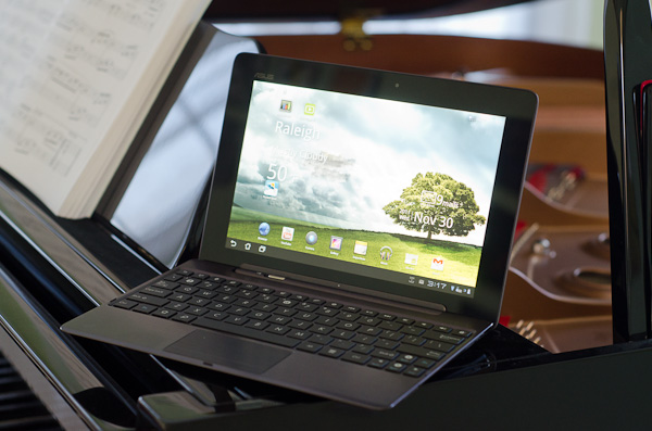
ASUS' first Android tablet was a knock out of the park. The original Eee Pad Transformer gave us a glimpse of the future with its keyboard dock while delivering a good Honeycomb experience for $100 less than the competition. As many sacrifices as ASUS had to make to reach its price point, the original Eee Pad remains one of the best Honeycomb tablets on the market. But the show must go on and simply being the cheapest on the block doesn't work anymore, particularly with companies like Amazon redefining what cheap means. It was time for a new flagship and today we have that tablet:
Priced at $499 the Eee Pad Transformer Prime will be available in North America during the week of 12/19.
| Tablet Specification Comparison | ||||||
| ASUS Eee Pad Transformer | ASUS Eee Pad Transformer Prime | Apple iPad 2 | Samsung Galaxy Tab 10.1 | |||
| Dimensions | 271mm x 175mm x 12.95mm | 263 x 180.8 x 8.3mm | 241.2 x 185.7 x 8.8mm | 256.6 x 172.9 x 8.6mm | ||
| Display | 10.1-inch 1280 x 800 | 10.1-inch 1280 x 800 Super IPS+ | 9.7-inch 1024 x 768 IPS | 10.1-inch 1280 x 800 PLS | ||
| Weight | 675g | 586g | 601g | 565g | ||
| Processor | 1GHz NVIDIA Tegra 2 (2 x Cortex A9) | 1.3GHz NVIDIA Tegra 3 (4 x Cortex A9) | 1GHz Apple A5 (2 x Cortex A9) | 1GHz NVIDIA Tegra 2 (2 x Cortex A9) | ||
| Memory | 1GB | 1GB | 512MB | 1GB | ||
| Storage | 16GB + microSD card | 32GB/64GB + microSD slot | 16GB | 16GB | ||
| Pricing | $399 | $499/$599 | $499 | $499 | ||
Whereas Motorola was first out of the gate with a Tegra 2 based Honeycomb tablet, ASUS is done with playing second fiddle. ASUS is NVIDIA's first and only launch partner for its new quad-core Tegra 3 SoC. The Google OS of choice is still Honeycomb, although I hear the Eee Pad Transformer Prime also happens to be Google's development and validation vehicle for Ice Cream Sandwich on Tegra 3.
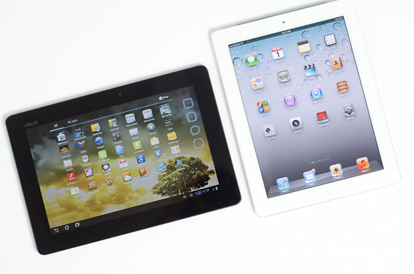
The Prime is everything the original Eee Pad Transformer was missing. It's thinner than an iPad 2 or Galaxy Tab and built out of aluminum and glass. Other than minor details like the buttons and connectors, your hands never touch plastic when using the Transformer Prime. Even those plastic buttons look and feel great. The tablet is just beautiful. It echoes the design language of ASUS' Zenbook, but without the disappointment in the panel department. ASUS' latest tablet actually has the best display of any tablet we've reviewed, including those made by Apple and Samsung (more on this later).
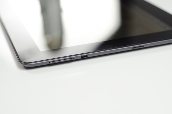
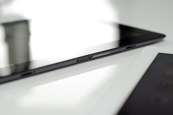
The usual suspects are carefully placed around the perimeter of the Transformer Prime. Held in landscape mode the power/lock button is at the top left corner, with the volume rocker perpendicular to and just below it on the left side. Also along the left side is a micro HDMI output for display cloning and a microSD card slot. A standard 1/8" headset jack finds itself on the right side of the tablet, and ASUS' standard dock connector is bottom center. The original Eee Pad had two speaker grills, while the Prime has a single, larger speaker on the back of the device. Audio output is surprisingly full but the tablet doesn't get loud enough to overpower a noisy environment.
ASUS went a little crazy with the rubber stoppers all over the Prime. The dock connector and its two mechanical retention/secure points are plugged with these things, as is the USB port on the optional transformer dock.
Just like last time, the Eee Pad Transformer Prime can be mated to an optional keyboard dock for an extra $149. The dock adds a QWERTY keyboard, trackpad, an SD card reader, USB port and comes with its own 22Wh battery. The dock's battery not only powers itself but it can charge the Prime's battery, almost doubling battery life.
We'll spend the next several pages going through every detail of the new Eee Pad Transformer Prime as well as NVIDIA's Tegra 3 SoC, but on the surface, ASUS has built a formidable tablet. How does it fare under closer scrutiny? Very well it turns out...
A Lesson in How Not to Launch a Product
Of all of the things ASUS has learned from running the PC side of its business it seems that the proper way to launch a brand new platform didn't translate over to its tablet business. I received the Eee Pad Transformer Prime 39 hours ago and the NDA lifted just now. While this is not atypical for many mobile launches, ASUS should know better.
To do a thorough review of any product the minimum time we need to adequately integrate that product into our daily routine and come away with a deep understanding of the product is at least a week. I say that's the minimum amount of time because if you give us more, then we can do even better analysis and spend even more time bug hunting. Most of the players in the mobile space don't really get this, and as a result they are complicit in the disappointing amount of analysis that's done on their hardware. This will change as time goes on, but I honestly expected more from ASUS.
My WiFi is Broken
What's one of the biggest risks when you give reviewers only 39 hours to review a product? If something is wrong with the review sample, there's hardly any time to fix it. This time I drew the short straw and my Transformer Prime review sample arrived with highly questionable WiFi performance. Both range and performance were impacted by whatever plagued my sample. I got less range and much lower performance than the original Eee Pad Transformer regardless of location or wireless access point. How bad? My Prime had difficulty sustaining more than 2Mbps over WiFi. ASUS and NVIDIA both sent me proof that there wasn't something wrong with other samples, and from their data it looks like the WiFi stack in the Prime is at least comparable to the original Transformer. The problem may just be limited to my unit, although I tend to believe that if something goes wrong once, it's bound to go wrong more than once.
Based on the fact that wireless performance improves when docked and upstream speeds are almost normal, if I had to guess I'd say that the receive antenna is either not fully connected or somehow impaired from doing its normal duty. I should have a replacement unit in by tomorrow, but unfortunately that means you won't see any WiFi dependent results here.
ASUS chose Broadcom's BCM4329 for WiFi/Bluetooth duty. Although the controller supports both 2.4GHz and 5GHz operation, the Prime is limited to work on 2.4GHz networks. The rest of the design is pretty standard - you get a single spatial stream at a maximum of 72Mbps. Real world performance, if ASUS/NVIDIA's numbers are to be believed, should top out somewhere in the upper 30Mbps area.
Update: ASUS got us a fixed unit, be sure to check out our follow-up here.


204 Comments
View All Comments
Penti - Thursday, December 1, 2011 - link
It looks like they have finally a pretty good product and software, they should dump the Eee pad and the redundant awkward name now and it would be even better :)Would love to see better optimized software, but this is what you could have expected plus with a great screen and I wonder how well it would work as a thin-client with Citrix? Keyboard and touchpad should make it a pretty good experience, does it? Chromebooks can just forget it any way :) Here we have form factor, local software, multimedia (Chromebooks are not even having accelerated H.264 as standard) and so on. With keyboard docked and standard, and not just a browser that was obvious would be replaced by a Android distribution of some kind any way. Maybe that time is now. Even though I wouldn't except Asus to complete that process. Fun to see them kinda getting there act together though.
Malih - Thursday, December 1, 2011 - link
I agree that Eee is an awful name, especially for a flagship/cutting-edge product.Eee is associated with low-end Atom netbooks, since that's the first device that uses the name. And I always hate that Samsung name their mobile devices Galaxy.
IMHO, the name Zenbook sounds good, maybe they should invent something consistent with that for their top-line tablet, Zenpad?
Penti - Friday, December 2, 2011 - link
Zenbook is still kinda awkward but it's better, ZenPad doesn't do anything for me and sounds silly. Transformer Prime is a pretty good name. Transformer might cause some confusion though, if they decide to release one without any keyboard attachment. Their Windows tablet PCs (slates as of now) might as well get some updated finish and release as a Zenbook slate though.MamiyaOtaru - Thursday, December 1, 2011 - link
"The 16:9 panel measures 10.1-inches diagonally, giving it a larger surface area than the iPad 2's 9.7-inch 4:3 display. "If you do your math, this isn't actually true. A 10.1" 16:9 display has a surface area of 43.58", while a 9.7" 4:3 display has a surface area of 45.17". This is one of the main reasons behind widescreen, they get to trumpet a larger diagonal measurement while actually saving costs on smaller total area. I am a little disappointed you fell for it.
MamiyaOtaru - Thursday, December 1, 2011 - link
some numbers you can plug in for verification (rounding all around!):16:9 10.0" display has sides of 8.8 and 4.951. 8.8/4.95 ~= 16/9 (correct ratios). 8.8² + 4.95² ~= 10.1² (correct dimensions for given diagonal, shown via pythagorean theorem).
area then: 8.8*4.95 = 43.96.
4:3 9.7" display has sides of 7.76 and 5.82. 7.76/5.82 ~= 4/3 (correct ratios). 7.76²+5.81² ~= 9.7² (correct dimensions for given diagonal, shown via pythagorean theorem).
area: 7.76*5.81=45.09.
45.09 is larger than 43.96. Ipad2 has a screen with a larger surface area. Run the numbers. Do it without dropping as many places as I did in this post, result will be the same. Again, disappointing
(I don't have a horse in this race, I own no Apple products. I do hate widescreen monitors though)
MamiyaOtaru - Thursday, December 1, 2011 - link
interestingly, the gap was closed somewhat when I dropped more places in typing up the second post. The first is more accurate, and the gap is bigger. But they both show the ipad as having more surface area, and that will hold true with pretty much whatever level of exactitude one wishes to calculate itAnand Lal Shimpi - Thursday, December 1, 2011 - link
It's actually a 16:10 panel, my statement was incorrect. But the Prime's display measures roughly 8.5" x 5.25". The iPad 2 by comparison measures approximately 7.75" x 5.75". 44.625 in^2 vs. 44.5625 in^2, giving the Prime a slightly larger display (albeit negligible).Solandri - Thursday, December 1, 2011 - link
At 9.7" diagonal and 4:3 aspect ratio, the iPad 2's screen is 7.76" x 5.82".At a 10.1" diagonal and 16:10 aspect ratio, the Prime's display is 8.56" x 5.35".
Solandri - Thursday, December 1, 2011 - link
Anand's math is right. His aspect ratio is wrong. The Transformer Prime has a 1280x800 screen, which is 16:10, not 16:9. At a 16:10 aspect ratio, you end up with 45.85 square inches of surface area.Personally I think 16:10 is the "right" aspect ratio for a multifunction device. You waste10% of the screen when displaying a 16:9 video. A 4:3 device wastes 25% of the screen. The extra width is nicer for web browsing too.
Where the 4:3 screen does better is displaying pages scanned from paper or magazines. Subtracting a 1-inch margin along all four sides, a 4:3 screen wastes 4% of its screen displaying a Letter-sized sheet of paper, while a 16:10 wastes 13%. (With A4 paper and 2-cm margins, it's reversed. The 4:3 wastes 12%, the 16:10 screen wastes 6%.)
But that's counter to the whole point of tablets - to free us from the shackles of a paper-bound world. As a media consumption device, I think 16:10 is the better aspect ratio. It's almost exactly the golden ratio too (1.62), so most art which is produced will fit in it better.
GnillGnoll - Friday, December 2, 2011 - link
For browsing the web and reading, portrait orientation is often a better fit. Though it requires a certain minimum width and resolution to work really well.